Charles-Auguste Questel, Ruines du temple de Diane, Nîmes (1838)
© Médiathèque centrale Émile Zola, Montpellier Méditerranée Métropole
THREE TYPEFACES FOR LATIN EPIGRAPHY IN FRANCE AND GERMANY, 1846–63
The Roman Empire’s concern for the permanence of writing over time, its omnipresence in the urban environment and the perenniality of the mediums used has allowed numerous antique writings to make their way to us and, according to Mireille Corbier, an expert on Roman antiquity, ‘the documents thus preserved allow us to imagine all of those that were not.’ Studying these artifacts is the work of the epigrapher, who ‘is interested chiefly in inscriptions incised with a sharp tool on hard material, such as stone, wood, metal, clay, etc.’ And so epigraphy is the study of ‘exposed writings’ of varying types and formats, letters that most often would be found abîmées (damaged), and which are described by the same term of inscription:
A text, typically of limited compass, that serves to commemorate, declare or designate; that is incised (but sometimes painted or executed in mosaic); that is of set purpose precise and deliberately solemn; that is realised in a durable medium (marble, stone, more rarely metal) or on objects of various types (paintings, hangings, jewellery, and so forth); and which is displayed for contemplation and reading by the public in an enclosed space (church, chapel, palace) or in the open (square, street, cemetery).
It was only from the nineteenth century onwards that epigraphy acquired a scientific status in Europe. The implementation of techniques for collecting inscriptions, their inventory and their decoding, was accompanied by the constitution of theme-based corpora into which the inscriptions were transcribed. The challenge of the epigraphic transcription was to achieve the most faithful typographic restoration of the content and form of an inscription in a printed publication. The projects dedicated to the inscriptions of the Roman Empire gave rise to the need for specific typefaces based on emblematic models of the time.
The great Roman inscriptions are Imperial. They were designed to impress, and do so with magnificent assurance. They reflect Roman showmanship and unity, order and flexibility. The great number of beautiful (and also of unskilled) inscriptions surviving throughout the Roman world demonstrate not only the widespread literacy and wealth, but also the unity and stability of the Empire. From Britain to the Atlas mountains, from Portugal to the Black Sea for over two centuries, the same styles of lettering are found everywhere.
These inscriptions are to be read in a specific form of writing, the classic Roman capital, the use of which began in 43 BC, only declining in the second century AD. The modulation of the brushstroke that defines its shape ahead of the engraving results in a slight contrast between the thick and thin strokes, as well as triangular bracketed serifs. Unlike our modern capitals, the varying widths of the letters come from proportions based on the square (quadrata). The pointed junctures at the top of the letters A, M and N, the splayed M, the tail of the letter Q that runs horizontally under the baseline, the open-lobed P and the long-tailed R are some of the characteristic details of the capitalis monumentalis.

Caractères Augustaux, Latin épigraphique and Monumental
This essay looks back at the first three initiatives in typography that attempted to adapt the classic Roman capital in the middle of the nineteenth century: the Caractères Augustaux by Louis Perrin in Lyon between 1846 and 1854, the Latin épigraphique of the Imprimerie impériale in Paris in 1854, and finally Monumental by Ferdinand Theinhardt in Berlin in 1863. The study of these three typefaces allows us to explore the motivations behind their creation, the methods used to produce them, their specificities, as well as their use in the publications that drove their conception: Inscriptions antiques de Lyon by Alphonse de Boissieu, Inscriptions romaines de l’Algérie by Léon Renier, and the first volume of the Corpus Inscriptionum Latinarum (CIL) by Theodor Mommsen and Wilhelm Henzen.
CARACTÈRES AUGUSTAUX
The city of Lyon occupies a special place in nineteenth century French epigraphy. The discovery of a large number of Gallo-Roman inscriptions in the city and the surrounding area aroused the interest of local enthusiasts, along with that of international specialists who visited the city in order to observe them, in particular at the lapidary museum, founded in 1805 by archeologist François Artaud (1767–1838) and installed in the courtyard of the Palais Saint-Pierre. Underneath its arcades, the museum sheltered lapidary inscriptions, bronzes and mosaics that illustrated the prestige and importance of Lyon in Roman times.

Fleury Richard, François Artaud copiant une inscription dans le temple de Diane (1828)
© Lyon MBA. Photo Alain Basset
This local context undeniably favoured the creation of the so-called Caractères Augustaux, the first typeface intended for the transcription of Latin lapidary inscriptions into a printed publication. This initiative came from the self-taught architect and epigraphist Alphonse de Boissieu (1807–86) who, in 1846, solicited the printer Louis Perrin (1799–1865) to produce a publication of the lapidary inscriptions of Lyon on his behalf. The 35 × 26.5 cm book, entitled Inscriptions antiques de Lyon, was published in six parts between 1846 and 1854. Over the course of 600 pages, de Boissieu describes 648 steles, monuments, altars, medals, seals and craftsmen’s marks.
Alphonse de Boissieu, Inscriptions antiques de Lyon (Lyon, 1854)
The title page as well as chapter headings are set in Caractères Augustaux while the main body of the book is set using a didone typeface, as was customary at the time. Other parts are set in Greek. As de Boissieu explains in the preface, the inscriptions that he examined himself are presented as engraved illustrations whereas the ones that were lost or recorded by other authors are, ‘for lack of a better alternative’, set in Caractères Augustaux:
For the monuments that no longer exist, or that I could not find, I provided the inscriptions after the comparative studies of the best authors; so that, alongside their kin that the engraver’s chisel had rendered so real and so meaningful, they no longer seem strange, the generous and enlightened assistance of M. Perrin, who revived the art of Jean de Tournes, of Roville and of Sébastien Gryphe, coming to my aid once again, I have been permitted to reproduce them with the true antique letterform of art’s most beautiful epoch.
Louis Perrin, second specimen for Caractères Augustaux (before 1853)
Engraved by Francisque Rey, at first Caractères Augustaux only possessed capitals, with no italics, and were limited to the Roman alphabet, without letters J, K, U or W, figures or diacritics. The contrast between thick and thin strokes is stark, especially in the larger sizes, and perfectly translates the epigraphic aspect. The variable width of the letters, based on a square, is respected, resulting in a strong difference between the wider letters (O, N) and the narrower ones (E, F, P, R). The serifs are strong and sharp, just like the short, stiff leg of the R tapering to a point.
The creation and use of the typeface is articulated around the content of the book in order to avoid – as much as possible – any anachronism:
For some it is a lie, as they do not belong to this epoch; but, falsehood for falsehood, I prefer that which brings them closer to the times of Augustus and the Antonins to that which dresses them in the costume of the nineteenth century. This innovation, that my subject allowed me to attempt, to which all of the honor goes to the skillful and intelligent man, to the distinguished artist who was willing to be associated with my work, deserves all of the attention and encouragement of men of good taste.
Henri Hours, north and east galleries of the Palais Saint-Pierre, Lyon
© Archives municipales de Lyon
With Caractères Augustaux, Perrin carried out what could be called the first revival in the history of typography. A practice that is quite common today, consisting of the intentional reemployment of ancient forms for a renewed use adapted to current technologies. According to the different studies carried out on Caractères Augustaux and Perrin, the latter was unable to find an appropriate typeface for the book in his own catalogue. As de Boissieu points out in his preface:
In the infinite collection of gigantic, dwarven, elongated, flattened, skeletal, microscopic, grotesque, gnarled typefaces that grows everyday, it is surprising that no one has thought of reproducing the beautiful antique letter whose proportions are so fortunately and wisely combined.
Perrin therefore visited the Palais Saint-Pierre to copy original models (sadly, none of those drawings survived). At the time the lapidary museum only possessed a handful of inscriptions dating back to the reign of the first Roman emperor Augustus (27 BCE–14 CE). And so Perrin had to imagine a kind of average letterform, synthesizing often partial inscriptions and filling in any missing elements. Although it is difficult to identify a single alphabet that relates precisely to the letterforms of Caractères Augustaux in the illustrations, one can nevertheless find certain inscriptions that possess characteristic details of the Roman capitals from Augustus’ reign, to which the name of the typeface makes a direct reference.
The resulting typeface, with its vestigial serifs, could also perhaps be considered as the first instance of a ‘new’ typographic style, which Maximilien Vox would name ‘incised’ in his Vox-ATypI classification of 1954. Incised typefaces are defined as evoking stone or metal engraving. Roman capitals, with their small triangular serifs and slightly flared stems, naturally find a place in this category.
Gustave Garnier dit Girrane, Le musée épigraphique (1903)
Caractères Augustaux were not universally welcomed at the time and their use outside of epigraphy is criticised. For Ambroise Firmin-Didot (1790–1876), heir to the Didot dynasty, their novelty could only be confined to this particular use:
I greatly appreciate the passion and work of M. Perrin and I am very grateful to him, especially in a city that possesses such beautiful examples of Roman calligraphy, for having reproduced their forms, but they can only be useful for a certain kind of books.
As Printer to the King and the Institut de France, Ambroise Firmin-Didot had actually been involved in a similar project a few years before. In 1843 he published Projets et rapports relatifs à la publication d’un recueil général d’épigraphie latine that mentioned the creation of a set of specific typefaces. Despite his efforts, and those of his son-in-law, the archeologist Adolphe Noël des Vergers (1804–67), who created a committee, solicited specialists, established an epigraphic library, and travelled abroad, this project was eventually abandoned for political reasons. A failure that certainly dissuaded Didot from embarking upon the production of typefaces.
The scientific projects at the Imprimerie impériale and in Berlin, and the following productions of a number of French foundries, would nevertheless prove de Boissieu right:
My attempt to rehabilitate the Roman capital will perhaps not remain without imitators.
Caractères Augustaux would be adapted for phototypesetting in 1987 by Franck Jalleau, Ronan Le Henaff and Jean-Renaud Cuaz at the Atelier national de création typographique (ANCT) of the Imprimerie nationale, under the supervision of Ladislas Mandel and José Mendoza. Franck Jalleau would finally complete a digital version in the mid-1990s.

Franck Jalleau, digital version of Caractères Augustaux (mid-1990s)
LATIN ÉPIGRAPHIQUE
In the early 1850s, the publication of several epigraphic publications by the Imprimerie impériale in Paris is accompanied by the production of new typefaces for the reproduction of ancient texts, based on the studies and surveys done by the books’ authors. The first of these typefaces, Latin épigraphique (literally ‘Epigraphic Latin’), is produced in 1854 under the guidance of historian Léon Renier (1809–85), one of the major figures of French epigraphy.
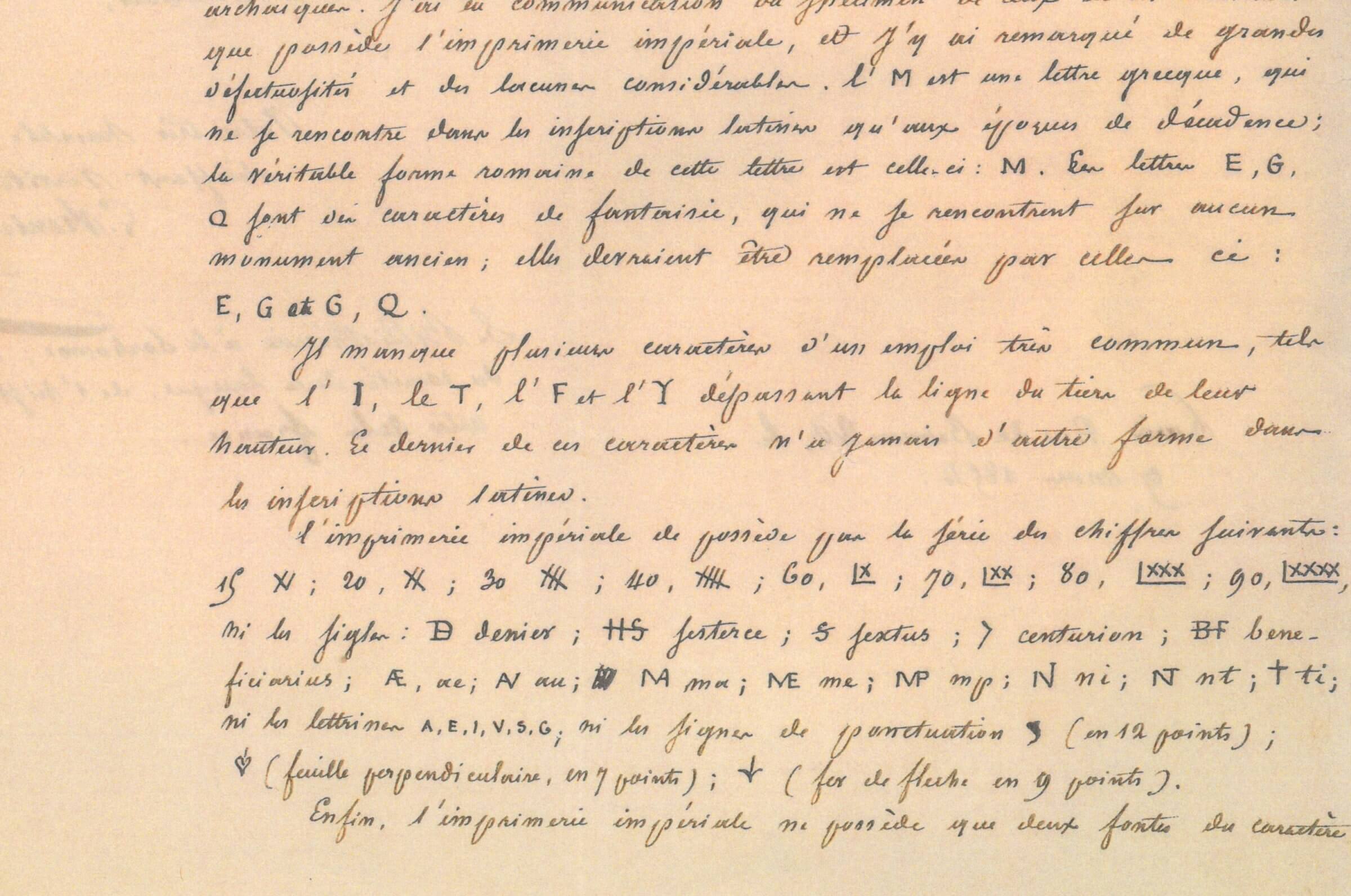
Two items of correspondence, that are today conserved at the Imprimerie nationale, help to understand how the project started. Following the government’s decision to publish the Roman inscriptions observed during a mission to Algeria, Renier could not find in the type specimen he was provided with the epigraphic and archaic sorts needed to successfully carry out his project. On one hand, the available combination of Greek and Latin signs did not correspond to the period in which the inscriptions were made. On the other hand, many signs were missing: the elongated forms of the letters I, T, F and Y, eight forms of Roman numerals, certain specific signs (denarius, sesterce, sextus, centurion), eight ligatures, and six initials and punctuation marks (ivy leaf pointing downwards, arrowhead).

Letter (detail) from Léon Renier to Vernoy de Saint-Georges (9 March 1854)
With the aim of ‘providing a more accurate and scholarly nature’ to his publication, Renier pushed the Director of the Imprimerie impériale, Jean-Baptiste Vernoy de Saint-Georges (1809–69), to make modifications. The latter authorised the engraving of new sizes as proposed by Jules Mohl, inspector of oriental typography, who in turn sets out to find appropriate sources:
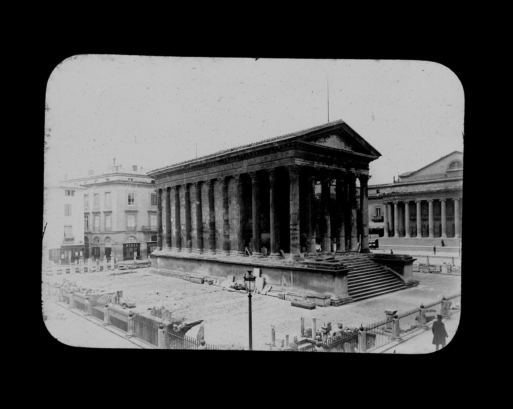
It was then a question of finding beautiful models based on the Latin inscriptions of the best times, in other words from the period between Augustus and Trajan. To this end I examined the Latin inscriptions at the Louvre and the Bibliothèque impériale, I contacted M. Rossi, curator of antiques at the Vatican so as to acquire the imprints of the inscriptions on Trajan’s triumphal arch, while M. Renier obtained the imprints of the inscriptions of Nîmes. I did not receive anything from Rome, but the inscriptions from Nîmes provided us with beautiful models and, together with M. Renier, I was able to craft an alphabet that, I think, will achieve our goal.
Hubert Robert, Interior of the Temple of Diana at Nîmes (1783) and Eugène Trutat, Temple of Diana, Nîmes (late 19th century). The temple walls bear graffiti by the Compagnons du Devoir et du Tour de France
Eugène Trutat, Maison Carrée de Nîmes (1897)
Like Lyon, Nîmes also has a long epigraphic history. Thanks to local discoveries and experts, it houses one of the main epigraphic collections in France. In the middle of the nineteenth century, this collection was spread over three open air, monumental locations. The first official depot was created in 1739 in the Temple de Diane, a Roman monument dating from to the first century CE. A second depot was created in 1823 at the Maison Carrée, an imposing Roman temple also built during the first century. The most fragile objects were placed on the inside, similar to a cabinet of curiosities, and all around outside in a lapidary depot. Finally, in 1849, other inscriptions were placed in the courtyard of the Porte d’Auguste, a vestige of the city walls that became a kind of municipal depot for antique objects. In 1894, the three collections were brought together in the cloister of the Musée archéologique, before being moved to the Musée de la Romanité in 2018.
Musée archéologique, Nîmes (early 20th century)
In 1854 Renier had been tasked with collecting rubbings, sketches and squeezes (paper casts) of all the inscriptions of Gallo-Roman monuments in France, with a view to produce a general publication of the inscriptions of Gaul. These documents are now in the Bibliothèque Mazarine in Paris. The majority of the records from the period 1850–55, are the work of archaeologist and historian Eugène Germer-Durand (1812–80). Made on different types of paper of varying formats, the degree of precision of these records differs greatly. The best fragments come from the lapidary museums in Nîmes, where the conditions certainly facilitated the recording. Excluding the inscriptions recorded after June 1854, those that are too fragmented or of poor quality, and those where the letters do not belong to the correct period (Rustica and Republican capitals, Gallic and Greek inscriptions…), Mohl and Renier were left with less than fifty inscriptions that they could use as references for Latin épigraphique. Nevertheless, though these inscriptions were good models, and representative of the period that they were interested in, none of the records stood out as an obvious basis. Indeed, few of the steles show all of the letters of the alphabet. This implied either deducing the shapes of the missing letters from the ones that were visible, or using different steles to complete the alphabet, particularly for special characters like the many ligatures.
Rubbings CIL XII n°3724 (‘Nîmes maison de Séguier IVe siècle’) by Edmond Flouest (left) and CIL XII n°3159 (‘Ancien couvent Des Augustins’) by Eugène Germer-Durand (right)
Fonds d’estampages d’inscriptions latines, Bibliothèque Mazarine, Paris
The sizes 8, 9, 10, 12 and 16 were engraved by Bertrand Lœulliet in 1854. The Latin épigraphique reuses classic proportions with quite large circular forms (C, D, G, O) while other letters are narrower (E, L, P, R). The serifs, pronounced and sharp, have two different slants on the S. The C has only one serif on the upper part and, unlike in Caractères Augustaux, there is a serif on the apex of the A. The letter D is quite bowed, the bottom part of the bowl of the P is not attached to the stem, the tail of the Q extends broadly below the baseline, and the G possesses a spur.
Latin épigraphique, box of punches (left) and frustes (right), engraved by Bertrand Lœulliet under the direction of Léon Renier (1854). Imprimerie nationale, Paris

Latin épigraphique, with five frustes and a damaged V, 9pt (1854)
Far exceeding Renier’s initial request, the 396 punches of Latin épigraphique cover the 23 uppercase letters required for the epigraphic texts of the time (there is no U, J or W), four letters with accents (Á, É, Í, Ó, Ú), an alternative M with two upper serifs, four special elongated letters (F, I, L and T), a set of 39 two-letter ligatures (AE, AM, AT, AV, CO, DI, DO, ED, HE, HI, ET flipped, IB, IM, IN, MA, ME, MI, MP, MV, NA, NE, NI, NP, OE flipped, PH, PI, PL, PT, RI, TE, TI, TL, TA, NT, TH, TR, VA, VL, VM), a couple of three-letter ligatures (APL, ATH), six struckthrough letters (beneficiarius BF, denarius D, sextus S, sesterce HS, and IS, X), three flipped letters (N, Ƨ, Ʌ), a few punctuation marks (triangular midpoint, large dot, comma), 16 Roman numeral shapes, four ivy leaves (two pointing down and two sideways), an arrowhead, the centurion or centurial, and a left facing ascia. It also includes two frustes, rectangular signs made of parallel oblique lines (here 11 or 14 lines), used to mimic the surface of the damaged stone. One finds a handwritten use of these frustes in the historian’s correspondence with his colleague Auguste Allmer (1815–99).

Letter (detail) from Léon Renier to Auguste Allmer (22 July 1854)
Latin épigraphique was used for the first time in the Recueil des Inscriptions romaines de l’Algérie, published between 1855 and 1858 and considered the first French scientific work of Latin epigraphy.
The first volume will contain: the text of the inscriptions reproduced in epigraphic types, in such a way as to imitate, as much as is possible, the form and organisation of the lines on the monuments; the transcription of these texts in running type, with an explanation of the abbreviations; the variants of the different copies that were made available to the author; and finally, all of the tables required to facilitate the research.
In this large format (37 × 28 cm), 560-page publication, 4,417 inscriptions are reproduced in 1, 2, or 3 columns separated by rules. Marcellin Legrand’s nouvelle gravure typeface from 1847 is used for running text and transcriptions are set in Latin épigraphique, in three or four sizes. A few inscriptions are also set in a second épigraphique typeface, adapted to the forms in use during the Christian period. 57 punches were engraved in size 14 by Ramé père in 1853, after the drawings of French archeologist Edmond Le Blant (1818–97).
Léon Renier, Inscriptions anciennes de l'Algérie (Paris: Imprimerie impériale, 1855–58)
It is in the Manuel à l’usage des élèves compositeurs, published in 1887 by Jules Jouvin, assistant foreman in the Imprimerie impériale, that one finds the necessary indications for the composition of such publications. Each inscription is treated individually. They are numbered and introduced by a general commentary that specifies their location and dimensions, and then transcribed in three successive steps: the inscription (in the epigraphic type), its transcription, and finally its translation (both in the running type). One might expect that the first typographic adaptation of the inscription would already be considered as a transcription. Indeed, this term implies the passage from one writing system to another, that is, from lapidary to typographic. The materials of the inscription, the tools, and visual appearance are different in every way. However, for Jules Jouvin, transcription describes the second step: the reformulation of the inscription without taking into account its formal appearance, for ease of reading. Composed ‘with the utmost fidelity’, the first composition of the inscription strives to replace the original (or an engraving) with an exact – but ultimately impossible – reproduction of its appearance with the help of an adapted typeface.
Jules Jouvin, Manuel à l’usage des élèves compositeurs (Paris: Imprimerie nationale, 1887)
The layout of the text of the inscription can be done in a lapidary style (centred), ranged left, in equal lines (justified), or justified vertically like if using a fixed-width typeface. The numbering of the lines of the inscription and their separation into columns are done all around in a smaller size. The punctuation of the original is respected through the use of median points and other special signs used to separate the words. Frames and cartouches are also carried over. The missing elements are reproduced either by blank spaces, large dots, or frustes. While the prints show alterations, the original punches are intact, which implies a degradation applied directly on the type during the composition. Indeed, these alterations are not limited to the frustes, as the typesetter also reproduces the damaged letters on a case by case basis, cutting or chopping the type with a file.
When, in the interests of accuracy, one wishes to reproduce half-erased or damaged letters, one does this by reducing their height with the file, or by altering them. […] During distribution, these letters are set aside to be used again if needed.
Visually, the letter seems to have lost a greater or lesser piece, or to have been scraped, by regular strokes similar to the frustes, recalling the crosshatched surface of a file. This practice of altering type is not new: Gryphe had already used it in his publication about the Table Claudienne (a bronze tablet made after 48 CE and discovered in Lyon in 1528) the first lines of which are damaged.
The inscription is then followed by its transcription. It is usually set in italics, sometimes in Roman and in a size smaller than the inscription. It does not reproduce the line breaks. Abbreviations and missing elements are indicated between brackets or square brackets. Concluding the description of the inscription, the French translation is then set in an indented roman, in the same size as the transcription.
From top: Table Claudienne (after 48 CE). Transcription in Guillaume Paradin, Mémoires de l’histoire de Lyon (Lyon: A. Gryphe, 1573). Illustration and transcription in J.-B. Monfalcon, Monographie de la Table de Claude (Lyon, 1851)
MONUMENTAL
The German historian Theodor Mommsen (1817–1903), specialist of antique Rome, took up the project of the French publication where it had been prematurely halted. In 1847, he reveals his ambition to develop a Corpus Inscriptionum Latinarum (CIL), only managing to convince the Academy in Berlin of its interest in 1855. It is a general publication of Latin inscriptions that brings together public and private inscriptions collected by different specialists. The first volume appeared in 1863 and the publication of new volumes continues today, conducted by the Berlin-Brandebourg Academy of Sciences.
Julius Friedländer, Theodor Mommsen at the Ponte della Maddalena, Castel di Sangro, Italy (1846)
Mommsen was one of the correspondents of the Commission française du recueil général d’épigraphie latine, and so was aware of the instructions presented by Ambroise Firmin-Didot in the report printed in 1843. One could imagine that Mommsen recognised the advantages of creating a typeface and that he wanted to do the same for his own corpus. He was also aware of Caractères Augustaux and published two texts on de Boissieu’s work in 1853. In one of them he enthusiastically describes the latter’s work as ‘the most splendid, and doubtlessly one of the most important epigraphic works published this century.’ He did not, however, make any comments about Perrin’s typeface. Finally, Mommsen visited the lapidary museum in Lyon in 1862.
Monumental, in a specimen published by the Ferd. Theinhardt typefoundry (c. 1890)
Staatliche Museen zu Berlin Kunstbibliothek. Photo Dietmar Katz. Courtesy of Dan Reynolds
At the time, Ferdinand Theinhardt (1820–1906) was producing typefaces for the Prussian Royal Academy of Sciences in Berlin. Theinhardt created a typeface called Monumental for the CIL, with 6 versions of capitals and no lowercase letters: Bourgeois Capitälchen and Versalien (small capitals and initials, 9pt), Cicero (12pt), Mittel (14pt), Tertia (16pt) and Text (20pt). Monumental has a medium weight and a low contrast. The specimen presents ligatures for the smallest sizes (AE, CI, II, LI, MV, OF, TE, TH, VA, VB, VE, VR, XI, XV, YR; AED, MED…) and special signs (two forms of A that belong to the time of the Roman republic, a flipped M for mulier [woman], Roman numerals for 5,000 and 10,000…) specific to the sources composed in the CIL. There doesn’t seem to be any U or J. The proportions respect the antique forms, with a clear difference between the narrow and large letters. The contrast between thin and thick strokes sometimes seems orthogonal (C, D, G, O). This orthogonality is reinforced by the orthogonal serifs of the E, F and L, as opposed to Caractères Augustaux and Latin épigraphique. The legs of M become straight in larger sizes, C and G almost lose their serifs, and the G has no spur.
Theodor Mommsen, Wilhelm Henzen, Corpus Inscriptionum Latinarum, vol. I: ‘Inscriptiones Latinae antiquissimae ad C. Caesaris mortem’ (Berlin: G Reimer, 1863)
Monumental first appeared in 1863 in the first volume of the CIL: Inscriptiones latinae antiquissimae ad C. Caesaris mortem. The work of Mommsen and Wilhelm Henzen, this imposing volume – 656 pages in a 37 × 28 cm format – contains 1,559 inscriptions that date from before Caesar’s death. The typeface, sometimes used in several sizes in the same inscription, is also combined with other typefaces on certain pages. As in the two previous examples, the running text and commentaries are set in a didone. In a system quite similar to that of the Imprimerie impériale, historian Jean-Pierre Waltzing gives a step by step description of the page layout, both from a typographic and scientific point of view. The space dedicated to an inscription can be quite short (three lines) or stretch to a number of pages, depending on its length, or the amount of commentary attached to it. In front of each numbered inscription is noted its current location, the place where it was discovered and its possible location in antiquity. Occasionally, details are provided as to the nature of the monument and the age of the inscription.
Then comes the text. One sets aside the monument itself, with its bas-reliefs; one describes it briefly, if this description is useful for the intelligence of the document. The text is printed in monumental capitals, even if the original is in cursive type; one does not then take the form of letters into consideration, but one often reproduces their size based on a scale that is sometimes indicated, and that is the same for the different lines of the same inscription; the separation of the lines is conserved, as are the ligatures, the dots, the ivy leaves or separating lines and accents. To facilitate reading, the words are always separated by an interval, even if they are combined on the stone.
A dozen or so typographic rules allow the content of the inscription to be completed through the use of italics (upper and lowercase), punctuation (full stop and exclamation mark) and borders. Because Monumental has no italic, the running type sometimes takes over. Italic uppercase letters are used to indicate either letters added after the fact, or letters that a previous publisher had seen and reproduced, but that have since been lost. As for the italic lowercase, it indicates either hammered out letters during the antiquity, or missing elements that it is possible to guess at. If nothing remains, the letter is replaced by a sign that resembles an exclamation point. The hammered out letters that were engraved in the same spot, or the new letters used to replace the hammered out ones, are either framed or set in slanted uppercase type. Every letter that has been erased by time, that is no longer legible, or that has been imperfectly copied, is replaced by a slanted line.
Zinc plate and corresponding page in CIL, vol. XV (1899). Part of an inscription on an amphora from southern Spain found in Rome, drawn by Heinrich Dressel
© Die Kulturgutscanner/MIK-Center GmbH
The material state of the original is sometimes emulated, either by altering the type or printing an illustration in zincography. The broken edges of a damaged stone are indicated by a line that mimics the fracture. Letters that have faded, but that are still visible enough to be distinguished, are printed in dotted type. Incomplete letters are reproduced by breaking the type in such a way that as to only reproduce the remaining part. These types are kept and can be reused for other inscriptions that present the same imperfections. Once again, similar methods can be observed in older publications. The Italian historian Lodovico Antonio Muratori (1672–1750) used some kind of frustes to indicate the broken areas of inscriptions in his work Novus Thesaurus Veterum Inscriptionum. And in his Notice des inscriptions antiques du Musée de Lyon, François Artaud simulates the edges of an inscription through the use of typographic signs such as hyphens and brackets.
Damaged letters from CIL, vol. I (1893)
François Artaud, Notice des inscriptions antiques du Musée de Lyon (Lyon, 1816)
The inscription is followed by the commentary of the epigraphists, accompanied by references to bibliographical sources. In the inscription, acronyms and abbreviations are explained between brackets, and restitutions are placed between square brackets (lost, hammered out, and corrected letters). The missing elements are represented by a series of dots whose number is equal to that of the lost letters, and a vertical stroke indicates the end of a line. A short explanation may be provided, as well as references to similar inscriptions.
Klassik, in a specimen published by the Berthold typefoundry (c. 1926)
Monumental was used in the volumes of the CIL right up until the beginning of the twentieth century, even for the transcription of graffiti observed in the ruins of Herculaneum and Pompeii, for example in the fourth volume by Carolus Zangmeister in 1871. In this particular case, the resemblance with the source is then quite distant, even contradictory, but the use of a different typeface to that of the running text simply allows a more general space of transcription to be defined. Monumental was ultimately renamed Klassik by the Berthold type foundry. The specimen, published in the 1920s for the occasion, presents sizes 6, 8, 10, 14, 16 and 20, this time completed with the letters and signs required for the composition of non-epigraphic texts. At the end of the 1970s, the CIL editorial team would select Sabon as their main typeface (although it had not been designed for epigraphic use), and from 1986 the transcriptions would be replaced by photographic reproductions or illustrations whenever they are available, and printed at the same time as the text.
REMAINS OF THE DAY
The production of these three typefaces took place in a dynamic scientific context, with the advance in the science of epigraphy, the creation of lapidary museums and a renewed interest for antiques in what was a literal race to the inscriptions. Similar to the turbulent political situation in nineteenth century Europe, the science of epigraphy has been both a subject of exchanges and of rivalry between German, Italian and French scientists. Despite this context, the circulation of ideas and of printed publications may explain the convergence of similar typographic initiatives in the middle of the century.
The remarkable collaboration between paleographers, printers and engravers, through the actual observation of epigraphic sources or records made during observations in the field, is reflected in the forms, as well as in the scope and specificity of the typefaces. Although based on similar models of the classic Roman capital, these three alphabets are visually distinct to each other. Caractères Augustaux notably stands out for its more faithful restitution of the proportions of the capitalis monumentalis, and its lapidary appearance.
At a time when the printing of text and images still required different techniques, the production of a typeface was primarily a practical solution to avoid printing processes that were specific to images, such as engraving or lithography. It also provided the inscription with the status of text rather than that of an image, which facilitated its scientific study. Ultimately the motivation was aesthetic as much as it is scientific: it allowed the transcriber to avoid the obvious anachronism of using a typeface whose appearance didn’t correspond to that of the inscription.
Furthermore, the degradation of the type on a case-by-case basis – a practice shared by the compositors of Latin épigraphique and Monumental – allowed closer emulation of the original sources, by translating the wear and tear of the material directly into the type, whose forms are usually thought of as stable. This activity of partially or totally damaging letters may seem surprising, but it was necessary in a scientific context that aimed for accuracy, guided by the commentary of specialists and the records that were provided in support. The voluntary action of abîmer thus provided the transcription with an ambiguous status, falling somewhere between illustration and text.
Translated from the French by Derek Byrne and Adrien Vasquez. This text is available in French on the ANRT website.
Thanks to Didier Barrière and Lucile Theveneau (Imprimerie nationale), Gérard Bruyère and Henrique Simoes (Musée des Beaux-Arts de Lyon), Ulrike Ehmig and Marcus Dohnicht (Corpus Inscriptionum Latinarum), Patrick Latour (Bibliothèque Mazarine), Alexandre Leducq, Sébastien Morlighem, Dan Reynolds and Marc Smith.
‘Abîmées’ was written as a companion text to our typeface Mercure.

Alphonse Simil, Fragments conservés dans le Nymphée (1874)
© Médiathèque de l’architecture et du patrimoine, Charenton-le-Pont