In the early 20th century, with the development of the industrial revolution and the increased mechanisation of production spurring a rationalist conception of the world,1 many countries establish national standards for a variety of industrial objects, both usual and professional. Lettering is not immune to this trend, and similar models are in use in most western countries. Here is a non comprehensive list:
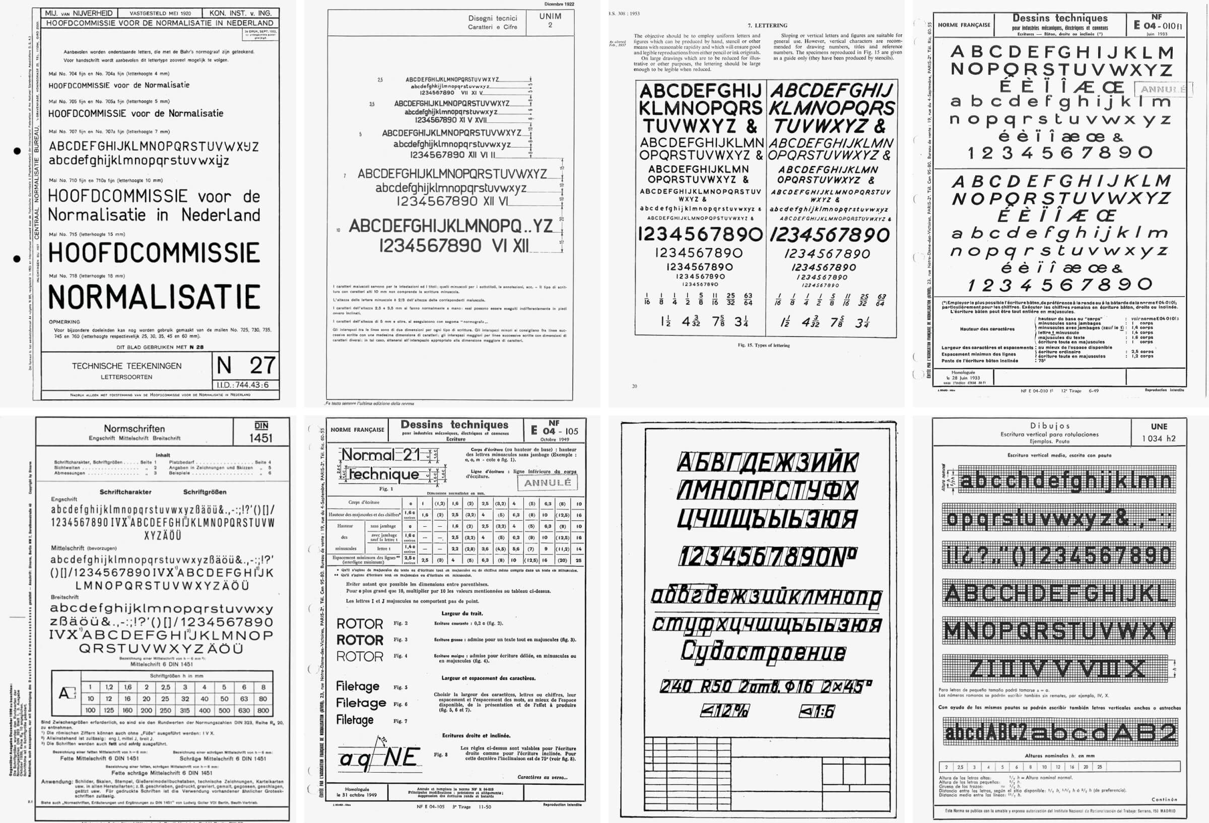
A non-comprehensive list of technical lettering standards: N27 (The Netherlands, 1920), UNIM 2 (Italy, 1922), BS 308 (United Kingdom, 1927), CNM-50/E04-010 (France, 1932–33), DIN 17 (Germany, 1938), E04-105 (France, 1949), OCT 2.304-68 (Russia, 1968), UNE 1034 (Spain, 1975)
French lettering standards published by the Afnor: CNM-50/E04-10 (1932–3), E04-105 (1949), E04-105 (1971)
In France, the Afnor (the French Standardisation Association) is created in 1926, and the first standard for lettering is formalised as early as 1932–33, followed by a second model in 1949. The need for compatible national standards grows out of the intensification and globalisation of commercial exchanges. This leads to the creation of the International Organisation for Standardisation (ISO) in 1947, in charge of setting international standards in the industrial and commercial fields. The standardisation of lettering becomes global at the onset of the 1970s.
Standards for lettering apply in the fields of mechanics, engineering, public works, construction, architecture, and urbanism. These so-called ‘industrial’ letterings are to be found in title boxes, captions and specifications of technical drawings, as well as architecture and urban plans.6
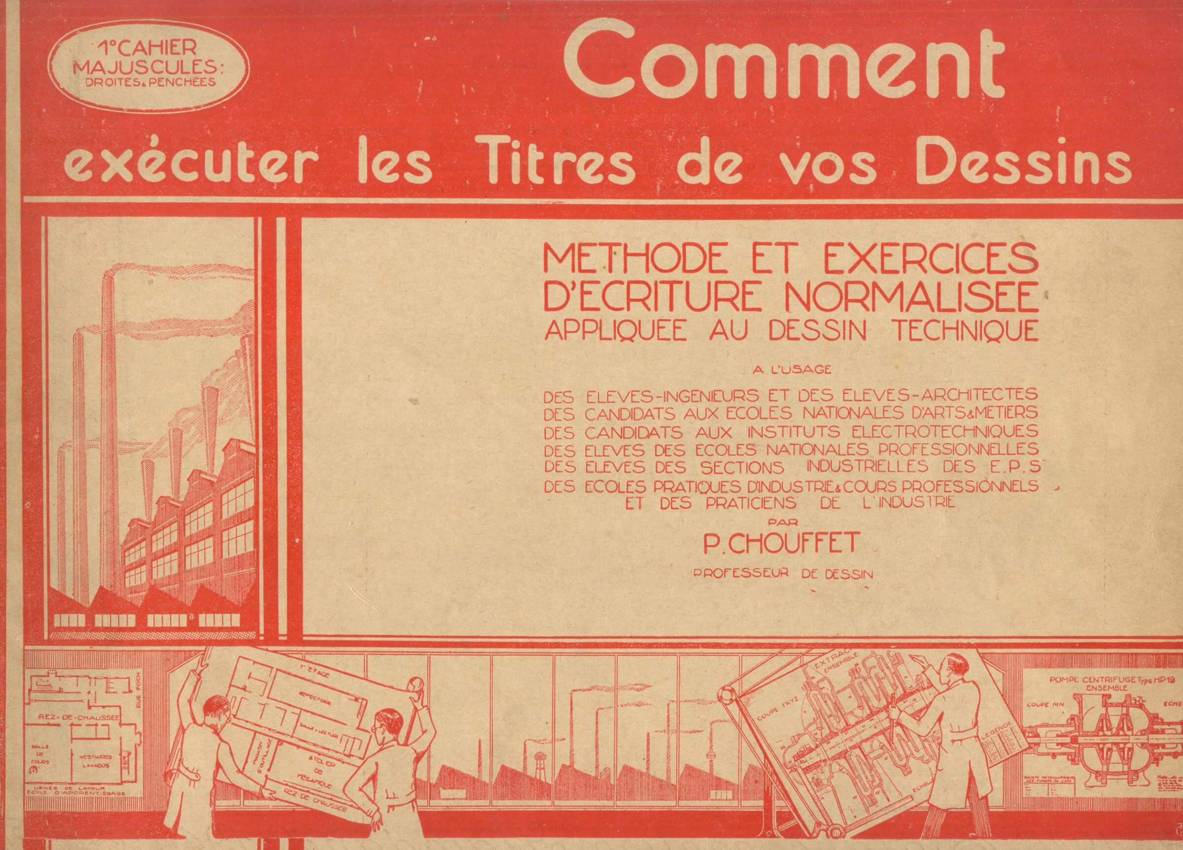
Industrial landscape with smoking chimneys and engineers in lab coats at work on the cover of Albert Chouffet, Comment exécuter les titres de vos dessins. Méthode et exercices d’écriture normalisée appliquée au dessin technique (Paris: P.A. Chouffet, 1950)
Each creation of a new standard encourages specialised publishers to commercialise methods7 addressed to students in architecture, art, design, and engineering schools. Models also appear as an introduction to more general technical and industrial drawing manuals. In France, only a single book, Les écritures bâton dans le cadre de la normalisation, written by Georges Kiénert and Jean Pelletier in 1959, is entirely devoted to the subject.8
Through a survey of the French standards for lettering in chronological order, this essay seeks to understand the way standardisation has taken hold of handwriting, as well as examine the numerous consequences it has had on the everyday practice of writing in specific sites such as the classroom, the engineer’s office, and the artist’s and architect’s studio. In addition of highlighting the ties between writing, typography and standardisation during the 20th century, this chronology is complemented by a study of other lettering models used in Europe, and by an analysis of the new tools that have contributed to the spread and universalisation of monolinear letterforms with rounded terminals.
Single-sided A4 sheet showing écritures bâtons (upright and slanted) of E04-010
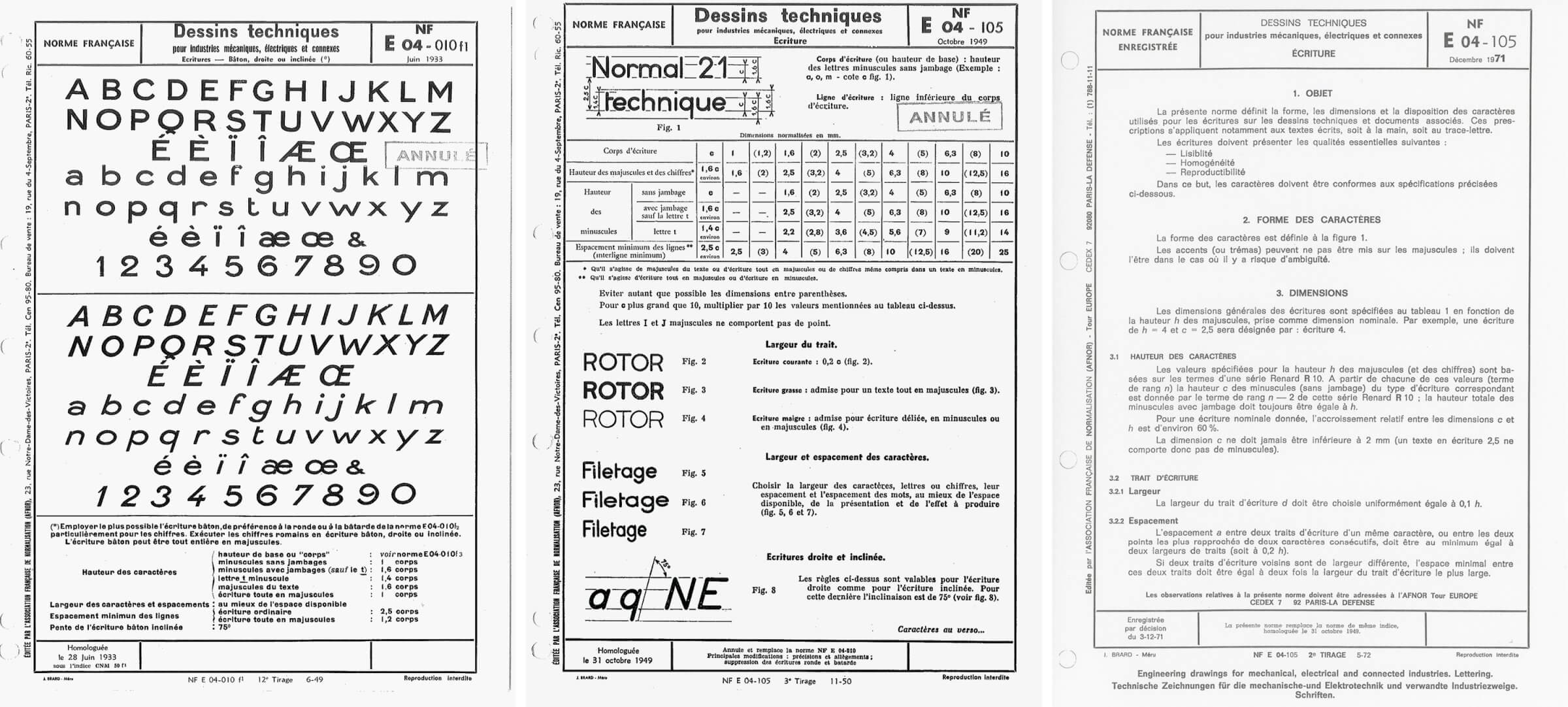
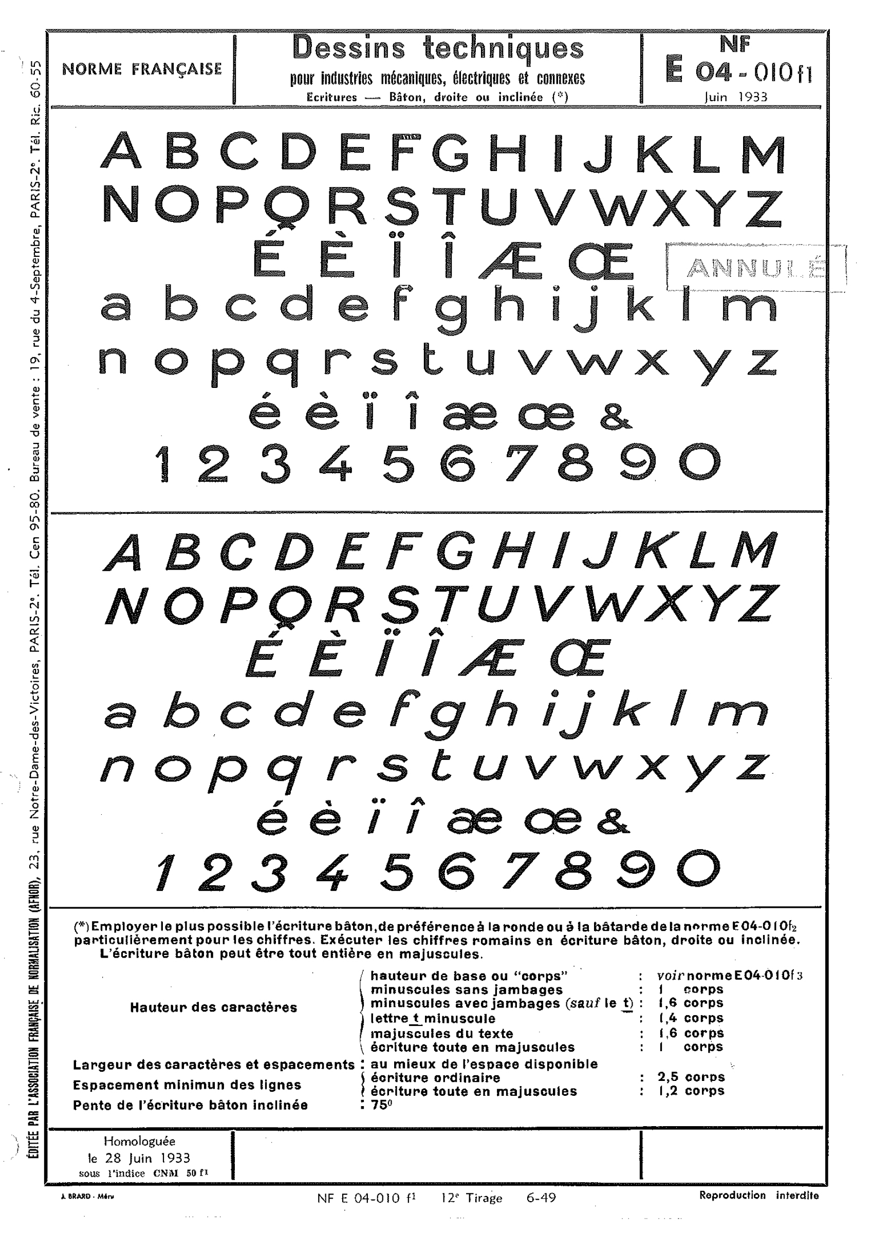
CNM-50/E04-10
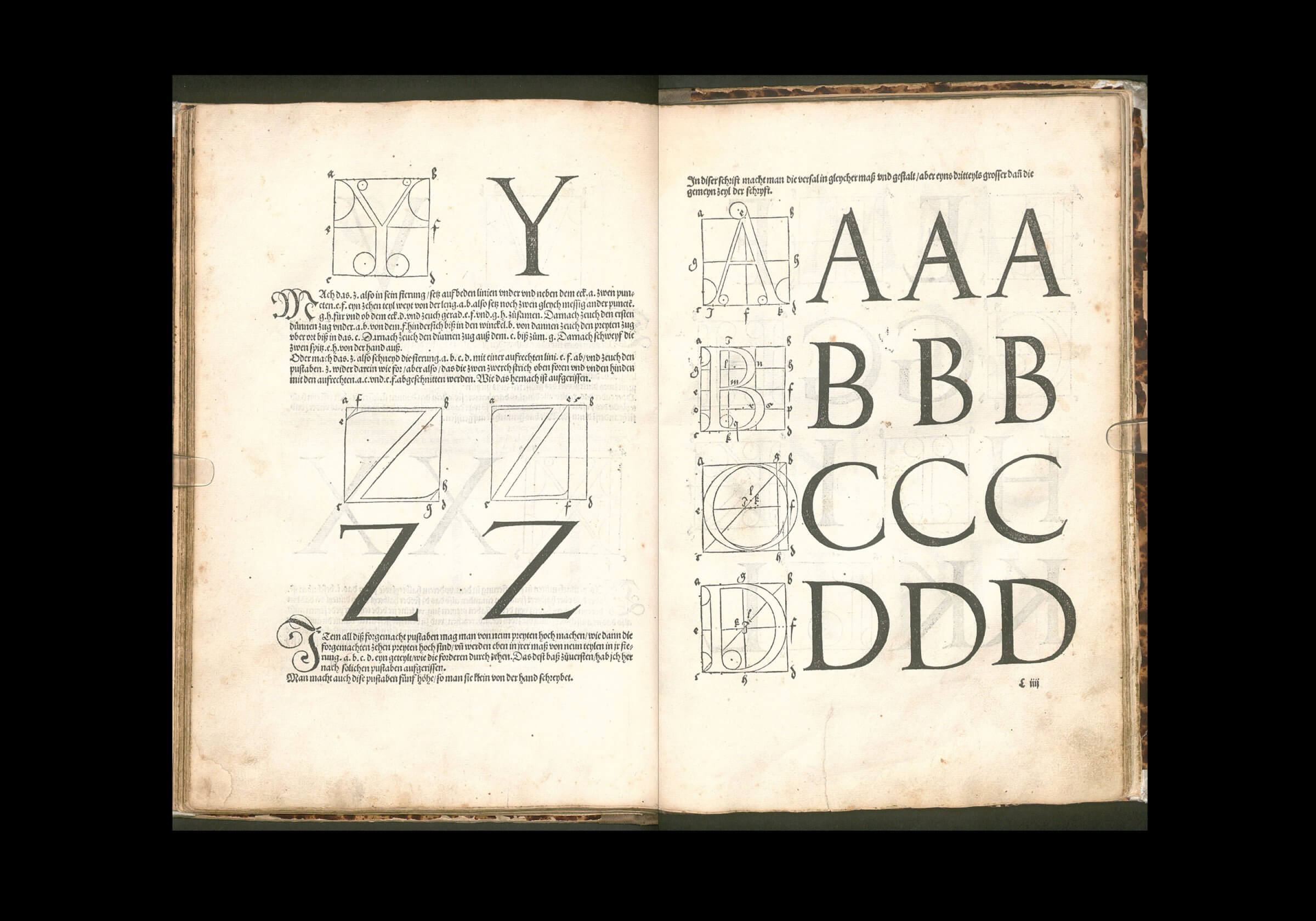
The first French standard, named CNM-50, is published in May 1932 by the Comité de Normalisation de la Mécanique [Committee for the Standardisation of Mechanics] (CNM). It is renamed E04-010 the following year by the Afnor. The first part of the standard introduces écritures bâtons (upright and slanted), while the second features écriture ronde and écriture bâtarde9 – two handwriting styles that are still widely used in France at the time. The other parts contain recommendations pertaining to the use and dimensions of these letterings.
Presented in an eminently administrative aesthetic, complete with rules and frames, on a one-sided sheet of paper, these standards succinctly indicate the appearance of the letters (uppercases, lowercases, numbers, four accentuated letters and three ligatures), but do not specify the method to draw them nor the tools required to do so. The more distinctive letters include the uppercase Q, which has a tail that reminds of cartographic lettering,10 the very broad lowercases, the double-storey a, the f and t without a bar on their left side. The loops of the 2, 6, and 9 are open. The ampersand does not exceed the x-height. The E04-010 model is published in standardised technical drawing manuals such as J M Valmalette’s,11 but does not seem to have been issued independently.
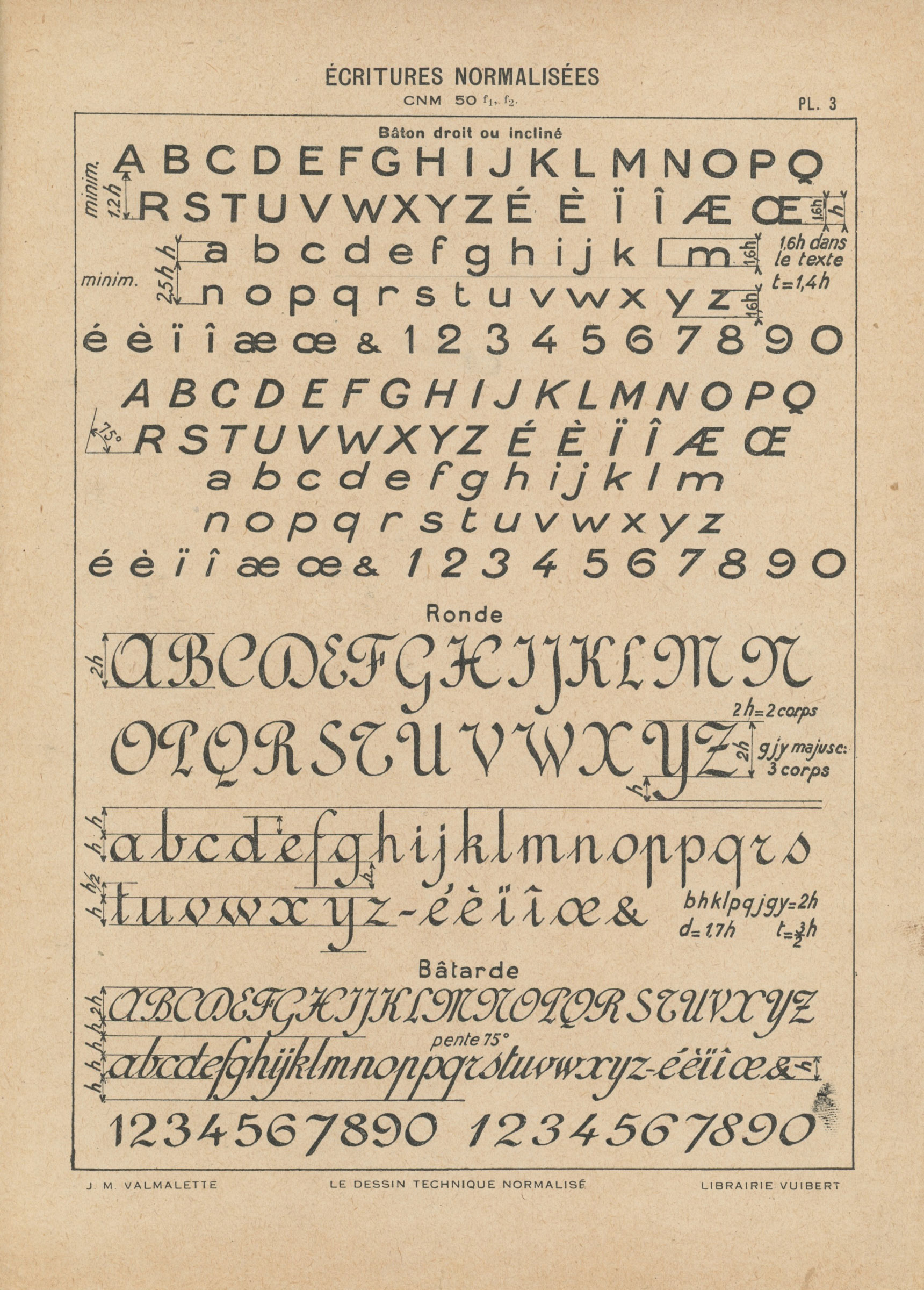
Two plates from J. M. Valmalette, Le dessin technique normalisé (1936). Plates 3 and 4 show écriture ronde and écriture bâtarde.
At that time, sans serif lettering is already ubiquitous in shop windows, advertisements, and posters.12 However, the design of these characters, referred to as ‘antique’ (a reference to their Greek, lapidary origin) or bâton (literally ‘stick’) in type specimens, remains approximative compared to their English, German, and Swiss equivalents.13 This discrepancy may partially be explained by the reaction of the most prominent French typographers. Chauvinistic, conservative, and opposed to any new and foreign production, they consider sans serif characters as ‘un-Latin’, and advocate against their use.14
Spread from the Antiques section of Deberny & Peignot, Spécimen général des fonderies, vol. 2 (Paris, 1935). Bibliothèque Forney, Fonds de la bibliothèque des arts graphiques
Just as unstable as these antique letterforms, the quasi-monolinear forms that compose the E04-10 standard distinguish themselves from the two other styles proposed, highly contrasted and slanted. On Valmalette’s plate 4, the word ‘Norme’, in écriture ronde and bâtarde, clearly shows the temporal discrepancy with the 1930s.15
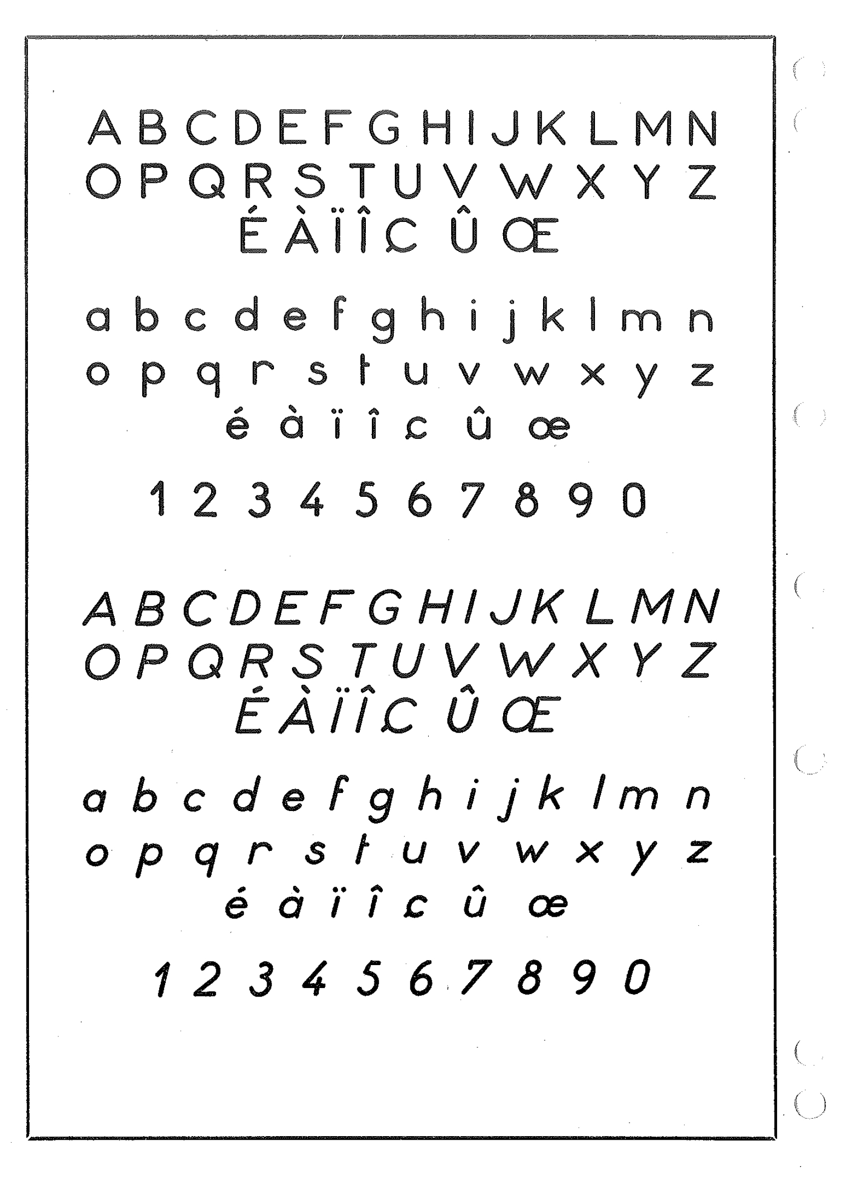
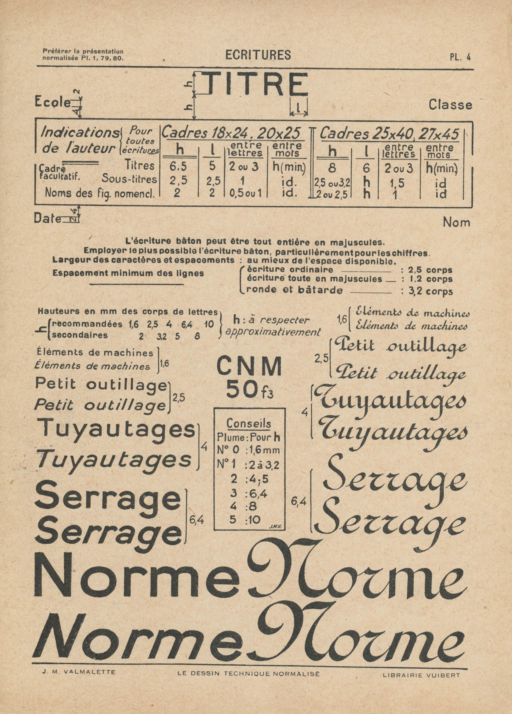
The double-sided A4 sheet of E04-105 (1949)
E04-105 (1949)
The use of écriture ronde and écriture bâtarde is discarded in the second technical lettering style, published under the name E04-105 in October 1949.16 Its teaching becomes ‘compulsory in technical (industrial and commercial sections, training for higher education schools) and professional education (learning centres, industrial drawing).’17 It is presented on a double-sided A4 sheet of paper with general indications on the front side.18
On the reverse, the alphabet is presented in two versions (roman and italic), with six accentuated letters and one œ ligature. The model appears more regular and homogeneous as well as more ‘constructed’ than the previous one. Among the most remarkable letters, the O and o became perfect circles, and the short diagonal cedilla in Ç and ç does not descend below the baseline. As for the lowercases: the single-storey a, the f similar to the previous standard, the extremely simplified t, composed of a stem and a short horizontal stroke on the right side only, or the x, resembling a multiplication sign.
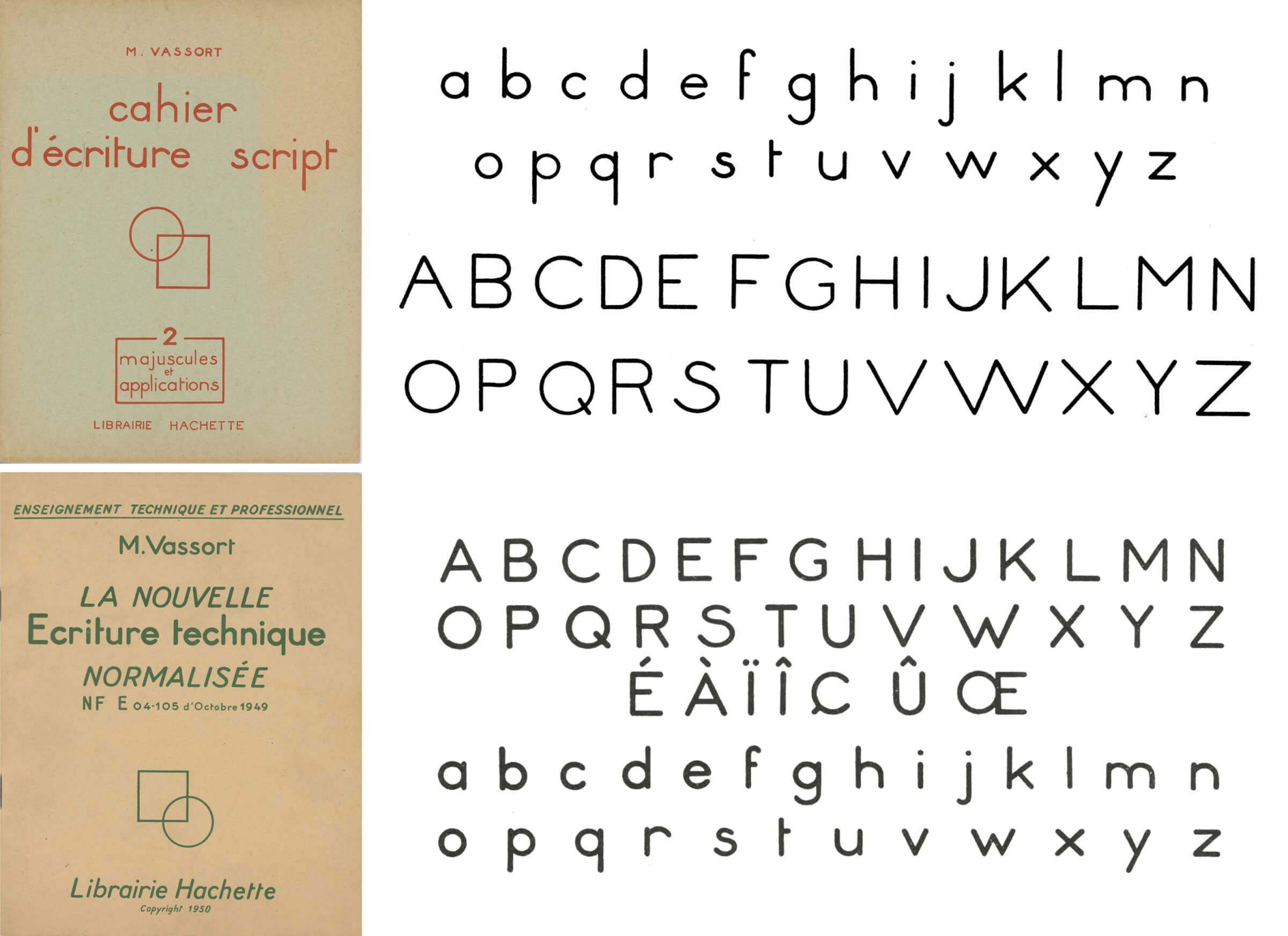
Maurice Vassort’s écriture script (1947) compared to Vassort’s nouvelle écriture technique normalisée (1950)
This standard leads to the publication of several handbooks by various technical education publishers, as well as a number of self-published manuals.20 Educator and author Maurice Vassort publishes his method in 1950 with Hachette.21 According to him, the new standard technical lettering is ‘inspired both by the old écriture bâton as well as écriture script.’22 Indeed, the ‘script’ lettering model he published in 1947 is strikingly close to the E04-105 standard.
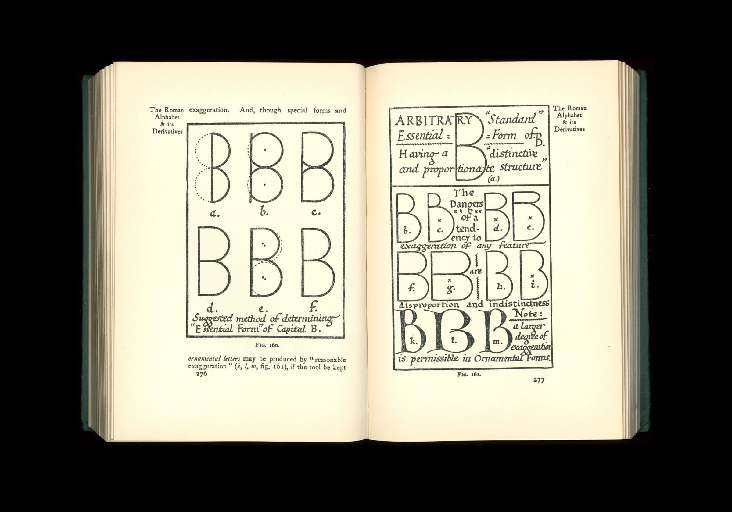
Edward Johnston showing the essential form of uppercase B in Writing & Illuminating & Lettering (1906)
PRINT-SCRIPT
The lettering known as print-script likely originated in England. At the dawn of the 20th century, Edward Johnston seeks to define the ‘essential forms’23 of the Latin alphabet with a ‘skeletal’,24 monolinear alphabet, as described in his seminal handbook Writing & Illuminating & Lettering:
The ‘Essential Forms’ may be defined briefly as the necessary parts. They constitute the skeleton or structural plan of an alphabet; and One of the finest things the letter-craftsman can do, is to make the Essential Forms of letters beautiful in themselves, giving them the character and finish which come naturally from a rightly handled tool.
He clarifies his statement several pages later:
The essential or structural forms are the simplest forms which preserve the characteristic structure, distinctiveness, and proportions of each individual letter. The letter-craftsman must have a clear idea of the skeletons of his letters. While in every case the precise form which commends itself to him is matter for his individual choice, it is suggested in the following discussion of a typical form – the Roman B – that the rationale of his selection (whether conscious or unconscious) is in brief to determine what is absolutely essential to a form, and then how far this may be amplified in the direction of the practically essential.
This model catches the attention of educators, who spread it in classrooms as well as in manuals and children’s books.27 Prior to the Second World War, it circulates in Anglo-Saxon countries and in Belgium under the name ‘print-script’ or ‘block letters’.28
The term ‘script’ may be confusing as it does not refer to a handwriting style with joined letters, nor to the typefaces known as ‘script’ that imitate handwritten letters. Paradoxically, écriture script refers to a handwriting style imitating sans serif typefaces.
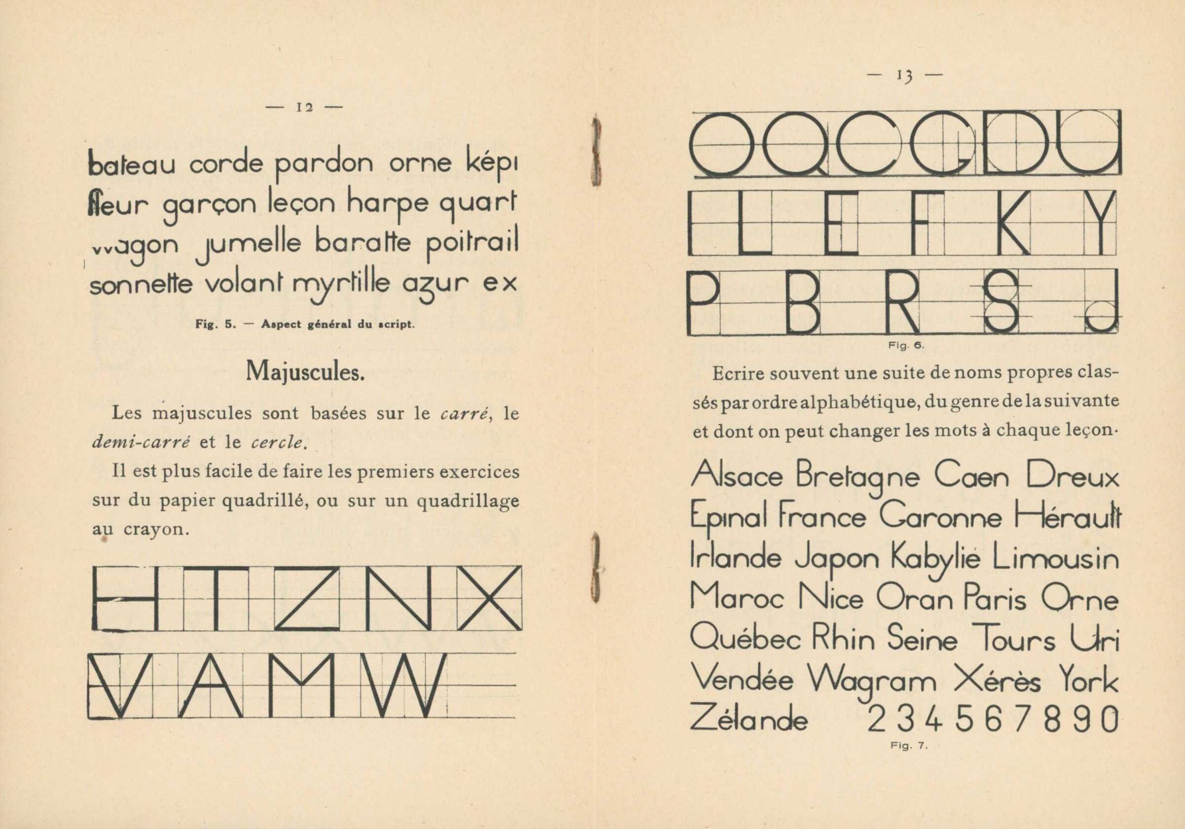
M. Poignon, L’écriture script avec des modèles d’écriture faits par une institutrice et des enfants (1927). The letter B on the right hand page shows a geometrical construction similar to Johnston’s, using two circles on top of each other
In France, this model does not meet much success at first, and only one book on the subject is published in 1927.29 After the Second World War,30 the teaching of écriture script is added to school curriculums, sparking endless debates among teachers,31 and a number of different methods were published over the following years. Poignon’s essay from 1927 was republished several times, and Vassort proposed a model in 1947, published in two volumes by Hachette.32 His introduction to standardised technical lettering takes up some of the arguments advanced in favour of écriture script, such as the consistency with the trends of the time beyond the mere industrial field:
This script, whose clear, simple forms follow modern aesthetic trends, is used for technical drawings, but also in any field requiring perfectly legible inscriptions: posters, registers, plans, accounting books, cartography… The flexibility and adaptability of standardized technical lettering justifies the extended range of its uses.33
These ‘clear, simple forms’ are based on elementary geometric figures – straight line, circle, semi-circle, square, rectangle and triangle – easily identifiable in the large, rounded proportions of the letters I, O, and V.
The model’s simplicity is also manifest in terms of proportions, as the letters are classified by width in a restricted number of groups: five for capitals and seven for lowercases.34 This forced simplification leads to aberrations for several letters that become too large, such as S, r, or x.
Despite Vassort’s commitment to anchor his method in ‘the logic of gesture’,35 the E04-105 standard is first and foremost a constructed script that is not designed for handwriting.36 René Henry Munsch, draftsman and teacher at the École Estienne and the École nationale des Arts Décoratifs de Paris, declares himself against these drastic forms and proportions,37 preferring the German Blockschrift:
We have said that bâton characters were a late adoption in the field of typography. In Germany, it was preceded, more than fifty years ago, by texts drawn with a large nib. This tendency, which responded to an abundance of advertising texts and the search for original marketing messages, ushered the trend of what our neighbors call Blockschrift. This term — ‘block script’ — refers both to the graphic restraint and to the compact appearance of advertisement paragraphs. This dense, tight aspect, inspired by the heaviness of incunable pages, is the expression of a perfect orthodoxy.38
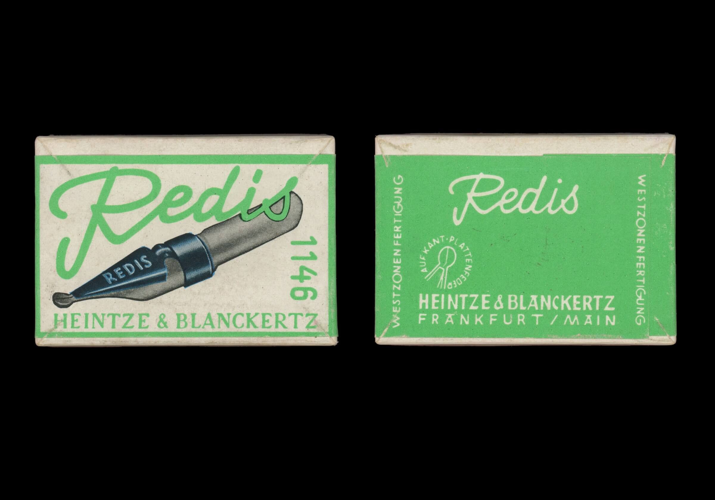
Box of Redis nibs manufactured by Heintze & Blanckertz, Frankfurt am Main
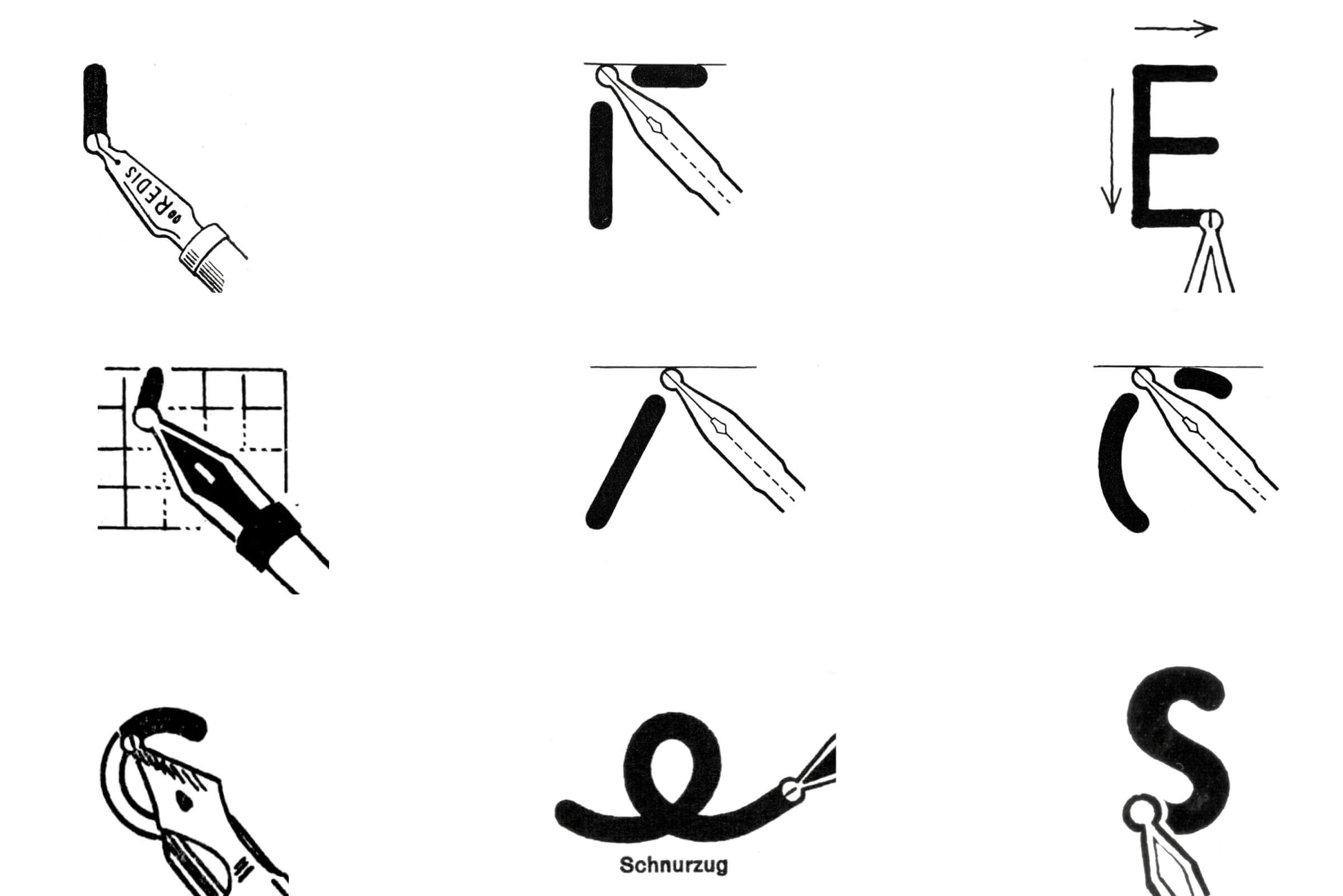
Examples of the monolinear stroke left by Redis nibs named ‘Schnurzug’ (literally a ‘cord being pulled’)
BLOCKSCHRIFT
In 19th-century Germany, the term ‘Blockschrift’ refers to low-contrast, sans serif roman letterforms39 in a country where blackletter typefaces and Kurrent script are still largely being used in printed works and handwritten documents. The birth of the Blockschrift calligraphic model purportedly dates back to the 1910s.40 It is encouraged by the commercialisation of round nibs called ‘Redis’ or ‘Plattenfeder’ that produce a thin, monolinear stroke named ‘Schnurzug’.41 Fernand Baudin attributes the invention of this nib to Heintze & Blanckertz,42 a company that started commercialising this tool around 1912.43 Prior to this date, every nib on the market produce some sort of contrast: drawing a monolinear stroke requires to use a woodstick,44 a cork, or the ‘Quellstift’,45 invented by the Austrian calligrapher Rudolf von Larisch.

Illustration by Rudolph Blanckertz (top) showing the evolution of the monolinear stroke with round endings from the trace left by a finger, a piece of wood, and the Redis nib, from ‘Zur Geschichte des Werkzeugtechnik’, Die zeitgemäße Schrift (1933). The ‘Quellstift’ (bottom) was an other tool to achieve monolinear strokes with round endings. From Ortwin Eberle, Schrift schreiben und zeichnen [1932] (Ravensburg: Maier, 1941)
Heintze & Blanckertz’s nibs are promptly imitated by other brands: Soennecken, Pelikan, Brause & Co. All of these manufacturers commission calligraphers (Hugo Busch, Wilhelm Krause, Hans Kühne, Hiero Rhode, Hans Schreiber, Günther Wagner) for designing small publications to accompany the nibs, showcasing different lettering models classified by use46 or nib type. These methods are designed for educational or professional contexts (‘Für Schule und Beruf’) as well as for the fields of advertising, art,47 or decoration.48 In 1931, Jan Tschichold writes a similar booklet intended for typesetters and typographers, in which the ‘Skelettenschrift’ is the first of a set of nine calligraphic exercises based on historical models.49

Test sheet by Jan Tschichold for Schriftschreiben für Setzer (1931). Estate of Jan Tschichold. Courtesy of Deutsches Buch- und Schriftmuseum, Deutsche Nationalbibliothek, Leipzig © Lilo Tschichold-Link
The first examples of Blockschrift are uncertain and ornamental, bearing witness to the graphic trends of the time.50 The models eventually stabilise during the 1920s: they are simplified, and use the proportions of Roman monumental inscriptions as the basis of their capitals. The same attitude is to be found in German typefaces published in the late 1920s, such as Paul Renner’s Futura and Rudolph Koch’s Kabel, both released in 1927. That same year, the DIN 1451 model is published for printing, engraving, and lettering by the Deutsches Institut für Normung [German Institute for Standardisation].51 A new, more technical model is therefore issued at the same time as Blockschrift: Normschrift.52 Blockschrift letterforms continue to circulate until the 1960s, when they eventually loose their ‘Roman’ proportions and become narrower and more homogeneous,53 following Tschichold’s recommendations, formulated as early as 1931.54 As Erika Schepelmann-Rieder notes,55 the ubiquitous dimension of these letterforms, now tedious and impersonal, make them hard to describe. Today, they still appear on administrative forms that require to be filled out in ‘block capitals’. In France, Munsch publishes in 1963 a method for tracing écriture bâton characters using the same principles as the German models.56
A non comprehensive list of Blockschrift models found in manuals and general publications about writing, calligraphy and typography: 1. Wieynk, Übungsheft zur Erlernung der Blockschrift (1913); 2. Krause, Deutsche Kopfschrift (1915); 3. Wieynk, Elementar Blockschrift (1916); 4. Michel, Künstlerische Schrift für Schule und Beruf (1920); 5. Hilder, Moderne alphabet (1922); 6. Hampel, Redis-Schrift (1924); 7. Hampel, Schriftschreiben (1925); 8. Soennecken-Schrifthefte Heft 1A Blockschrift (1928); 9. Tschichold, Schriftschreiben für Setzer (1931); 10. Koch, Die Schrift im Malerhandwerk (1934); 11. Rhode, Blockschrift (1937); 12. Pelikan schrift-ubung heft Nr E4 (1940); 13. Eberle, Schrift schreiben und zeichnen (1941); 14. Schlöbcke Schrifthefte 611 Blockschrift (1944); 15. Hauschild, Die Schrift (1951); 16. Kuhne, Sieben Alphabet (1953); 17. Nies, Blockschrift (1956); 18. Schenk, Die Schrift im Malerhandwerk (1958); 19. Lange, Schrift schreiben, zeichnen, konstruieren… (1965); 20. Korger, Schrift und Schreiben (1971)
The Redis nibs, called plumes à palette in France,57 confer rounded stroke endings to the E04-105 letterforms, conveying a certain softness and even a childlike aspect, close to the ‘script’ writing used in schools. The monolinear stroke – another result of the use of this tool – is also one of the factors of this standardisation of lettering. It is only appropriate that advertising for pens adapted to standardised and script lettering is included on the back cover of Vassort’s publication.58

Advertisement for Minerva lettering guides showing a ‘funnel’ nib and a simplified lettering guide where elements have to be combined to obtain letters
NORFRANCE
Unlike the plumes à palette, ‘funnel’ nibs are used with lettering guides that are developed in parallel, and whose use is authorised, if not recommended, to obtain more regular results.59 The inside back cover of Vassort’s handbook includes an advert for lettering guides manufactured by T.L. Minerva. Initially established in Switzerland, this firm produces circular stencils that are imported in France by Ambroise Biscaras and his partner Diter, who eventually bought the company. After relocating in Paris, the company starts manufacturing stencils in their current rectangular shape, made piece by piece on a pantograph, from a brass template, until the onset of the Second World War.

Italian lettering guides, from Francesco and Teresa Ginoulhiac, Tecnica e grafia nel disegno (Roma: Minerva Italica, 1969), p 18
After the war, ‘the first product for technical drawing was Norfrance, a model that conformed to the 1949 Afnor standard, which allowed the company to stand out from the German manufacturers who followed the DIN standards. This slightly changed the letterforms, but more importantly, it did not correspond at all to the diameters of the instruments. The Afnor standard was based on the Renard series, which established a correspondence between the character heights and the hollow diameter of the lettering instruments.’60
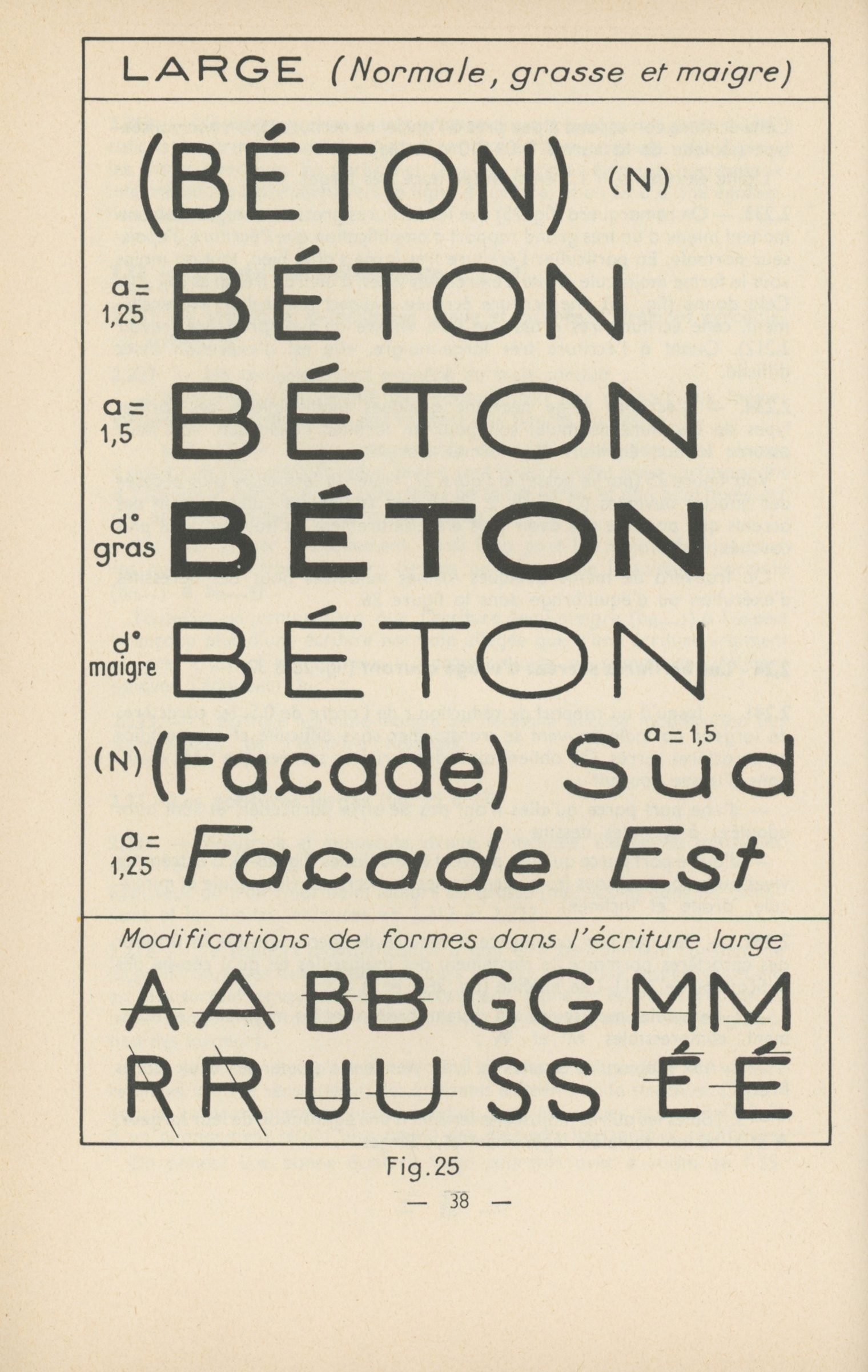

Even though the E04-105 standard features two alphabets, changing the thickness of the stroke and varying the width of the letters allows for to obtain a wider set. From Georges Kiénert, Jean Pelletier, Les écritures bâton dans le cadre de la normalisation (1959)
The E04-105 standard introduces variations of weight and width – a definitive improvement in comparison to the previous model, which ‘produces nine straight alphabets (normal, large, narrow regular; normal, large, narrow bold; normal, large, narrow thin, and, naturally, nine slanted alphabets).’61 The ‘adaptability of standard lettering’62 prefigures the typographic variations that would spread widely from the second half of the 20th century onward, most importantly with the emergence of large and coherent typographic families, starting with the 21 styles of Adrian Frutiger’s Univers, published in the mid-1950s, and the interpolation technologies enabled by digital tools.
Two pages from E04-105 (1971)
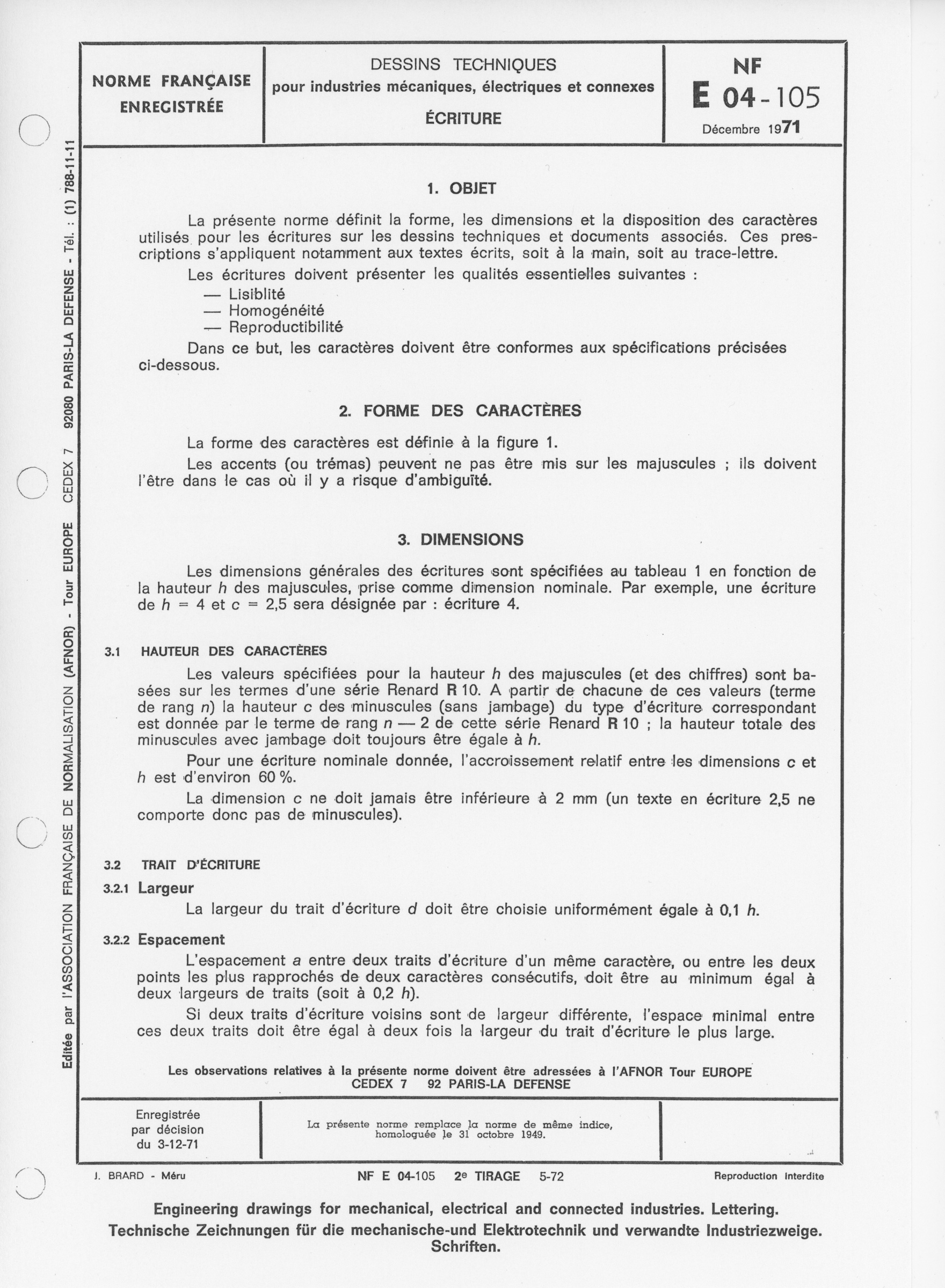
E04-105 (1971)
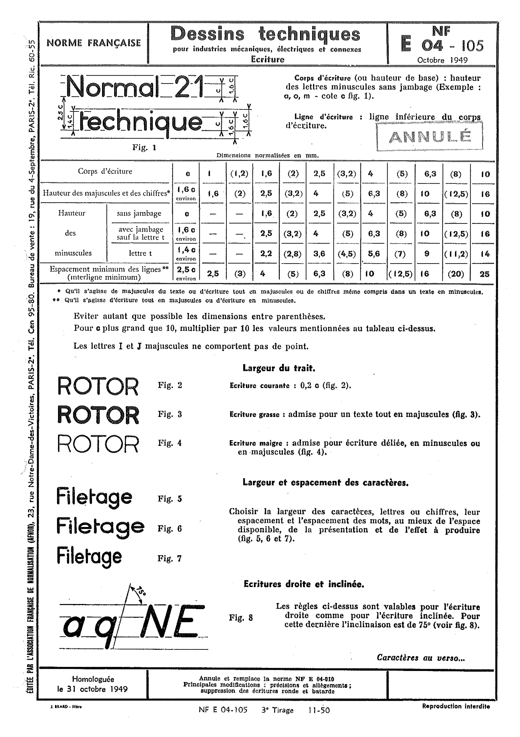
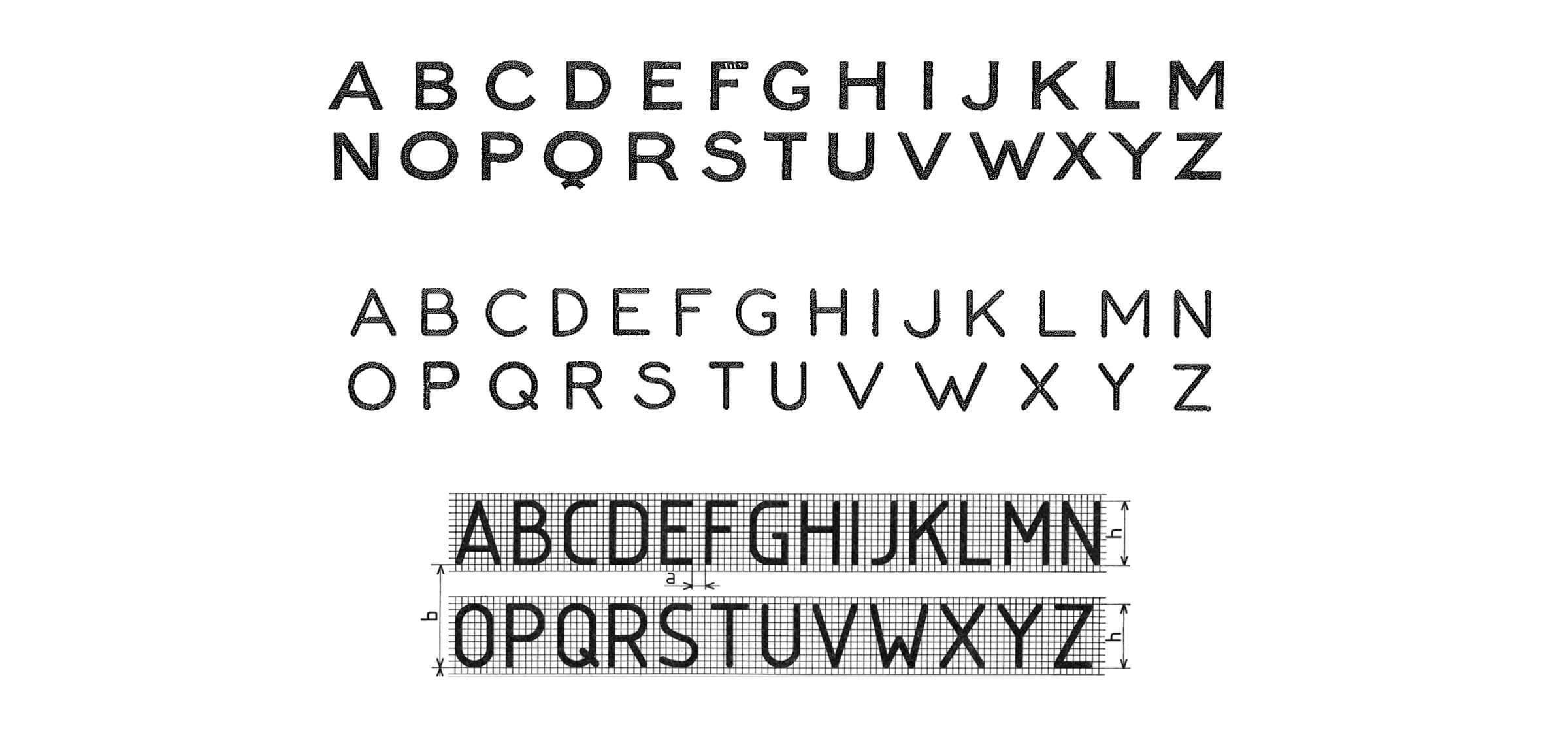
The last standardised technical lettering is published in the early 1970s. A first standard appears in 1971 (NF E04-105, December 1971), updated the following year (NF E04-105, September 1972), before being approved as an international standard in 1974 (E ISO 3098/1). This ‘international standard specifies the characteristics of regular characters used for lettering on technical drawings and their attending documents. It is primarily intended for texts written with a stencil,63 but may also apply to longhand formats.’64
This standard contains two sets of letterings, A and B, in upright and slanted versions, differentiated by the width of their strokes. The model includes a number of Roman numerals (I, V, X), punctuation marks, mathematical symbols and a Greek alphabet. Doing away with the previous standard’s flexibility, this new one seeks to bring three essential qualities: legibility, homogeneity, and reproducibility.65 These three points have an impact on various aspects of lettering: the letterforms and their general proportions, letter and word spacing, as well as the sizes of lettering.
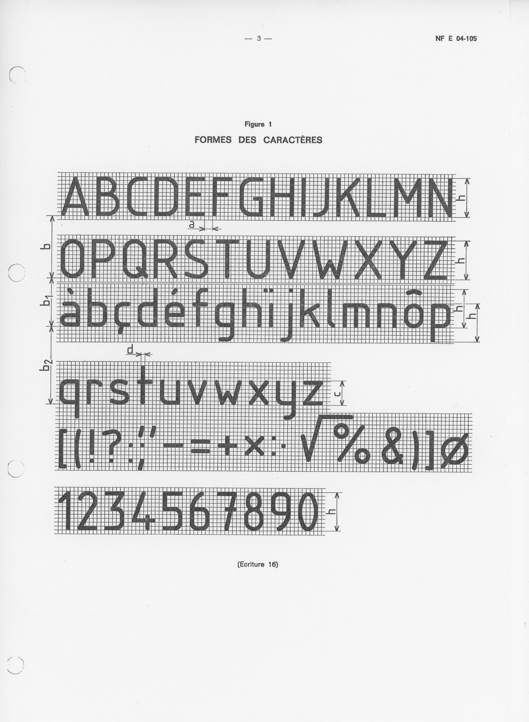
Longer and more comprehensive than the previous ones, the document accompanying this new standard displays the letters on a grid, which facilitates their understanding while reinforcing their rigidity. The height of uppercases and numerals is set at ten units, the x-height seven, and the ascenders and descenders occupy three additional units. Compared to the previous French standard, the ISO 3098/1 forms are narrower and no longer refer to geometrical forms, as shown by the O and o, whose verticality evokes the number zero. Yet, a principle of differentiation sought to ensure better conditions of legibility,66 as can be seen in the lowercase l, which differs from the capital I through a slight return on the baseline. The uppercases and lowercases are divided in five width groups.67 The general aspect of this lettering is reminiscent of the 1970s, and of the aesthetic of early computers and low-resolution displays. It is also reminiscent of the OCR-A and B letterforms,68 which were equally the result of ‘efforts of standardisation […] and of stylisation’69 in the mid-1960s, as they were optimised for automated document processing.
The curved letterforms of ISO 3098/1 have a rectangular aspect and, as Ferdinand Ulrich put it, evoke ‘a sort of technoid Blockschrift’.70 This is the result of a search for visual homogeneity and legibility, which contribute to their large counters despite their narrowness:
In order to obtain a stroke with a constant optical density, to avoid the thickening of the intersections, and to facilitate the writing process, the letters should be formed in such a way that the strokes intersect and connect at an approximative right angle.
The photographic reproduction devices of the time, which make possible sometimes important scale reductions, but in return alter the quality, impose a better ‘resistance’ of forms.
The current importance of reprography (the faithful and exact reproduction of a document) and of microcopy (the miniaturisation of documents) has required selecting very precise characters, whose conformity to the standard’s specifications needs to be very high.71
In order to do so, precise lettering values are recommended:
The height h of capitals and numerals is the nominal dimension. It characterises the lettering. Example: if h=7mm, one says ‘lettering 7 NF E04-105’, or simply ‘lettering 7’. The ratio between two consecutive nominal dimensions is √2.72
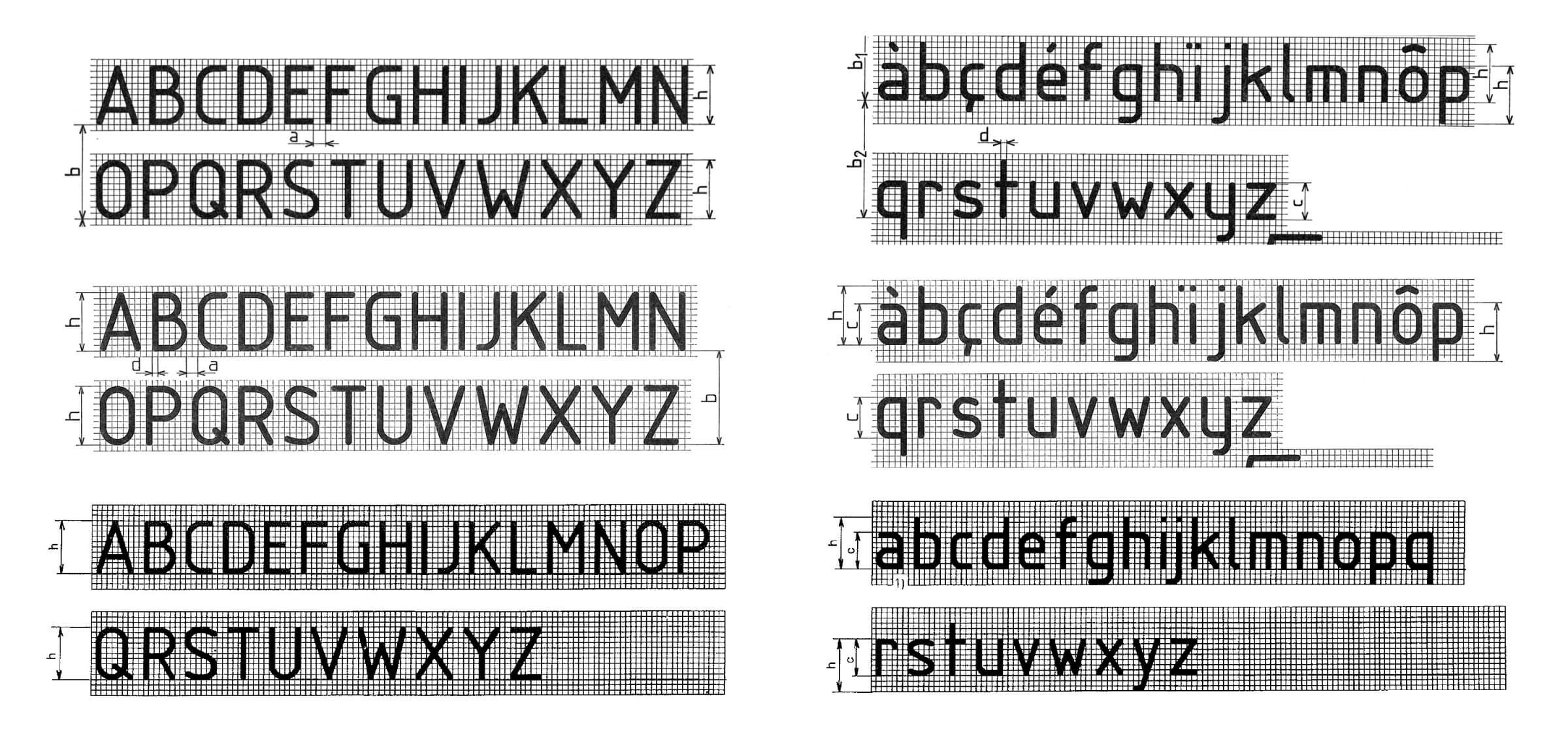
Comparison of three updates of E04-105 (1971, 1972, 1978)
The slight modifications implemented over the course of the four updates (1972, 1974, 1977, 1978) are worthy of mention. The lowercase and capital S – a complex form as it is entirely composed of curves – take on three different forms. The height and the length of the G’s bar is modified at each update, like the size of the bowl of the lowercase a. This is a source of astonishment for Florian Hardwig and Thomas Maier:
In view of all the efforts that went into standardisation, it is an amusing anecdote that the committees couldn’t decide on the definitive form of the lowercase ‘a’, so the ISO recommendation includes both a monocular and a classical form for this letter.73
Albrecht Dürer, Underweysung der messung mit dem Zirckel un[d] Richtscheyt, … (Nuremberg, 1525) © Bayerische Staatsbibliothek, Munich
MECHANICAL FRENZY
Standardisation ushers a new stage in the long history of the rationalisation of letterforms: from Felice Feliciano, Luca Pacioli, Albrecht Dürer or Geoffroy Tory in the Renaissance, the Enlightenment’s Romain du Roi as well as the Bauhaus’ universalist attempts in the 20th century.74 For Frank E Blokland, the first typographic characters, from their very onset, are the result of a standardisation of the humanist handwriting in use during the 15th century.75 These successive aspirations for rationalisation remind us that the forms of our writing are not only the result of aesthetic concerns, but also of political and economical considerations, and attest the ‘relations between the shape of characters and power’,76 the nature of which, today, is industrial and technological.
The simplicity and the clarity of the forms, the monolinear strokes, the simplified width classified in restricted groups, the geometrical construction and the use of a grid are major characteristics demonstrating the standardisation of lettering and type. Just like the anonymity of standardised models, produced by a committee whose members are never named. Yet, this simplicity does not guarantee their longevity, and as these three successive technical standards show, standards age relatively poorly, as a twenty-year gap is enough to make it obsolete.
Uppercases from the three French lettering standards published by Afnor: CNM-50/E04-10 (1932–3), E04-105 (1949), E04-105 (1971)
Although it contributes to impoverish the diversity of national models, international standardisation, as it encourages the uniformisation of forms and uses, thus makes possible the definition of ‘the common’.
It is understood: a world is being invented in this mechanical frenzy, the multiplication of accessories, transfers and correspondences of materials and formats authorising a new production of letters and figures. A world is being invented because the relation to the world, the way of acting, the potentials for intervention in the world are transformed: these mechanical and paper mediations, these organisations, this numbered weaving, these grids reconfigure the forms of activity, enable one to redeploy them, and produce a new grandeur of capitalism and of government.77
La revue du bureau: organisation, mécanographie, enseignement technique…, issue 286 (December 1934)
Standard lettering, its accompanying tools (nibs, stencils, methods), and any other instrument that contributes to the standardisation of letterforms, extend what Delphine Gardey calls the ‘paper revolution’, which undergoes a progressive mutation until the advent of computer technology. The DIN format, created in 1922 by German bureaucrat Walter Portsmann for the Deutsches Institut für Normung provokes a concrete revolution within the paper industry, whose consequences would be visible far beyond the office and the practice of writing:
Where the paper format was ‘normed,’ a norm-size binder followed. As both a normed object and carrier of further norms, the two-dimensional sheet of paper was represented graphically as surrounded by an ever-expanding entourage (Gefolge) capable of formatting space. Soon after came the norm for the filing cabinet, and, lastly, the building that housed this normed furniture. That building, in turn, was built from normed parts: the window, the door, the brick all were defined by the DIN norm’s outline.78
Spread from the 7th French edition of Ernst Neufert, Les éléments des projets de construction [Architect’s Data] [1936] (Paris: Dunod, 1996)
Bauentwurfslehre [Architect’s Data], published in 1936 by German architect Ernst Neufert, exemplifies the complete rationalisation of our environment. In spite of its numerous updated editions, Neufert’s book continues to perpetuate a normativity of bodies and of behaviors while reinforcing gender roles. In the field of writing, standardisation has now become globalized.
There are hundreds of standards concerning ‘script and writing’. All ingredients of the writing-process have experienced standardization, including the writing-tools (from the diameter of graphite-pencils to the keyboard of mechanical typewriters to the fonts of computer-based word-processors) as well as the writing-material (rules for paper with respect to quality and size).79
As ubiquitous graphic forms – appearing on schoolchildren’s notebooks, technical diagrams, engraved professional plates80 – they have contributed to the durable installation of sans serif characters in 20th-century everyday life. They also have been instrumental in the boom of letters with rounded terminals,81 whose use, popularised during the 1970s and 1980s, still persists today, long after the disappearance of the round nibs that had facilitated their development.
XOXO
Translated from the French by Jean-François Caro.
Thanks to Thierry Arnoult (Gravotech), Alain Biscaras (Minerva), Mathieu Lommen, Sébastien Morlighem, Benjamin Sasse (Deutsches Buch- und Schriftmuseum, Deutsche Nationalbibliothek, Leipzig) and Dan Reynolds.
‘Essential forms’ was published as a companion text to our typeface Axo, designed by the author.

